A marketing strategy for onboarding new users and retaining customers over time.
How might we redesign iHeartRadio's lifecycle emails to adhere to a new design system, welcome new users, and provide a clear explanation of the company's product?
People who register for iHeartRadio or upgrade tiers

UX Designer
UX Researcher
Uta Knablein
Bri Phillips
Elise Masanga
Stanley Belliard
Ada Guo
Vadim Volovodovskiy
June - August
2019 (2 Months)

1. After viewing the welcome email, users were able to accurately explain what the iHeartRadio app does
2. Users reported having a very good first impressions of the product and being excited to try it out
3. Users described the emails to be easy to be understand, attention-grabbing, and well organized
4. The modular design allowed for a faster technical implementation
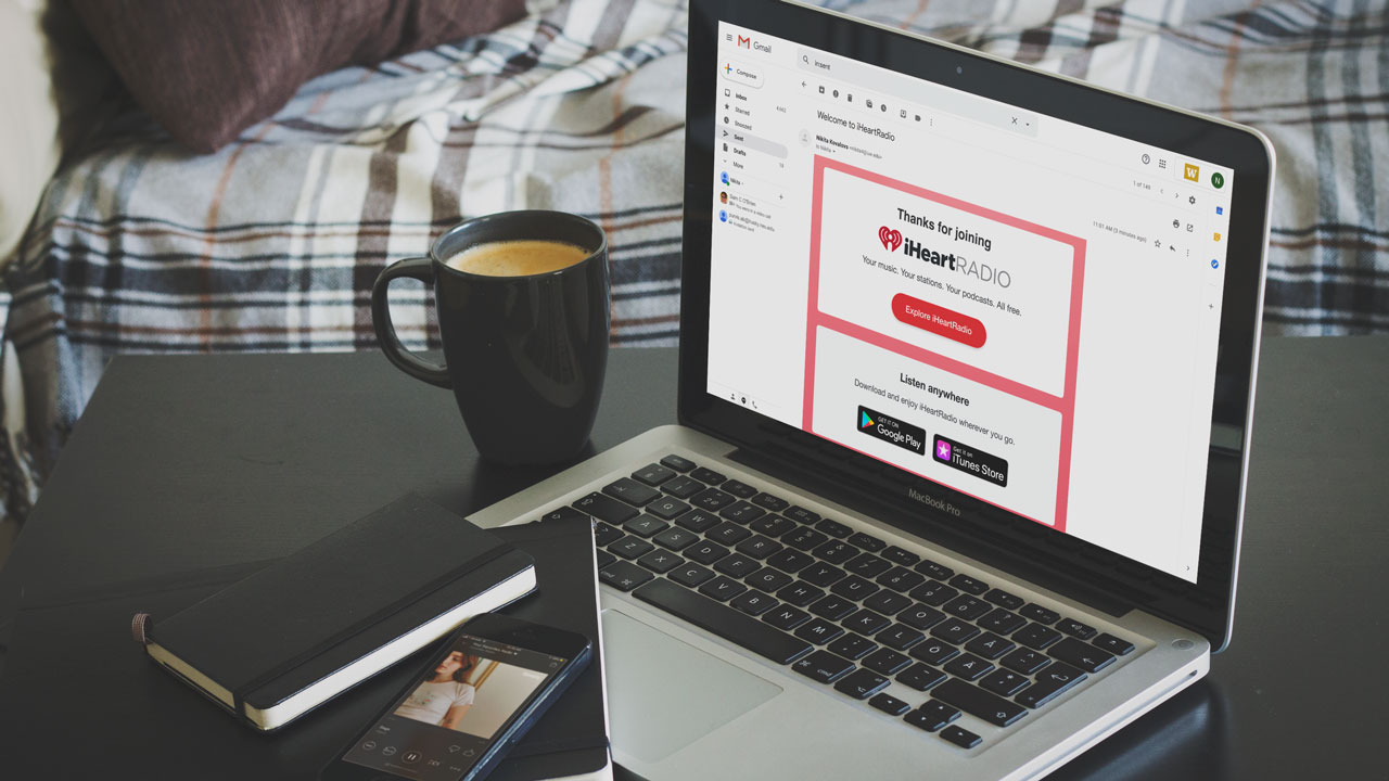
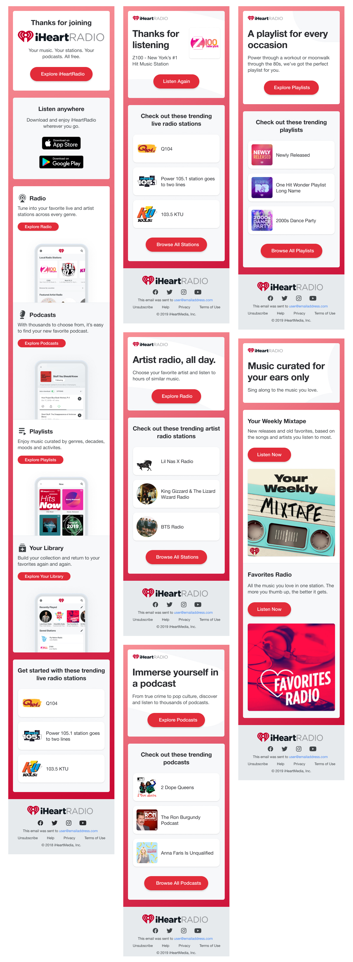
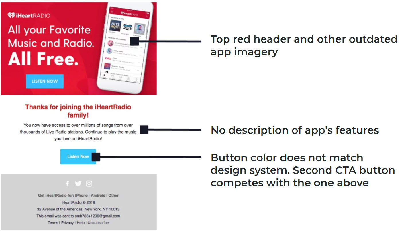
Early in the Summer of 2019, iHeartRadio updated its app to an entirely new design system leaving the marketing team stuck with an outdated series of lifecycle emails.
With the new design system, the old lifecycle emails became dated. They were inconsistent with the new design system and there were too many sets of emails to upkeep.
The emails onboard new users and communicate important information at different stages of product use. They are users' first impressions of the product and company.
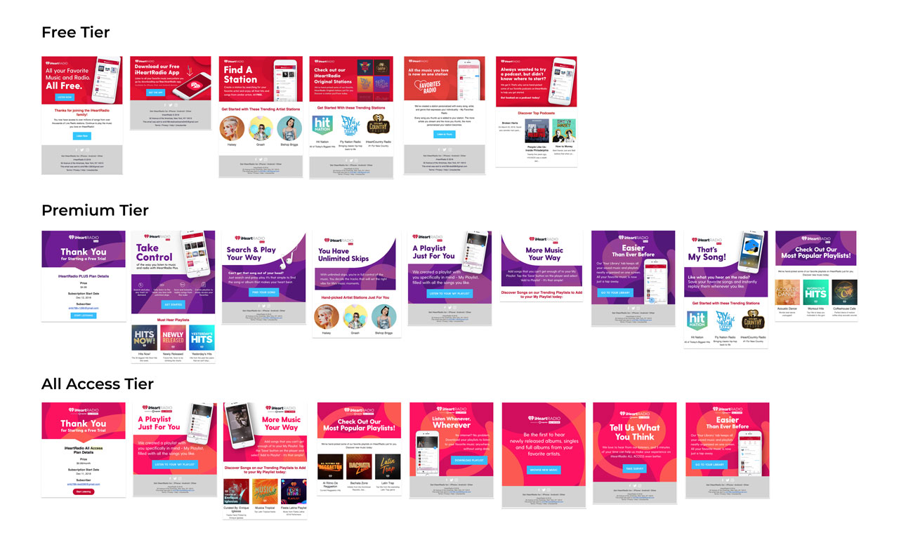
It is difficult to upkeep three different sets of lifecycle emails for three different subscription tiers. It is inefficient to create one-off designs for each email in each tier.
I wrote, conducted, and analyzed a usability test of a competitor's emails to understand what elements resonate with users and understand how they respond to different layouts.
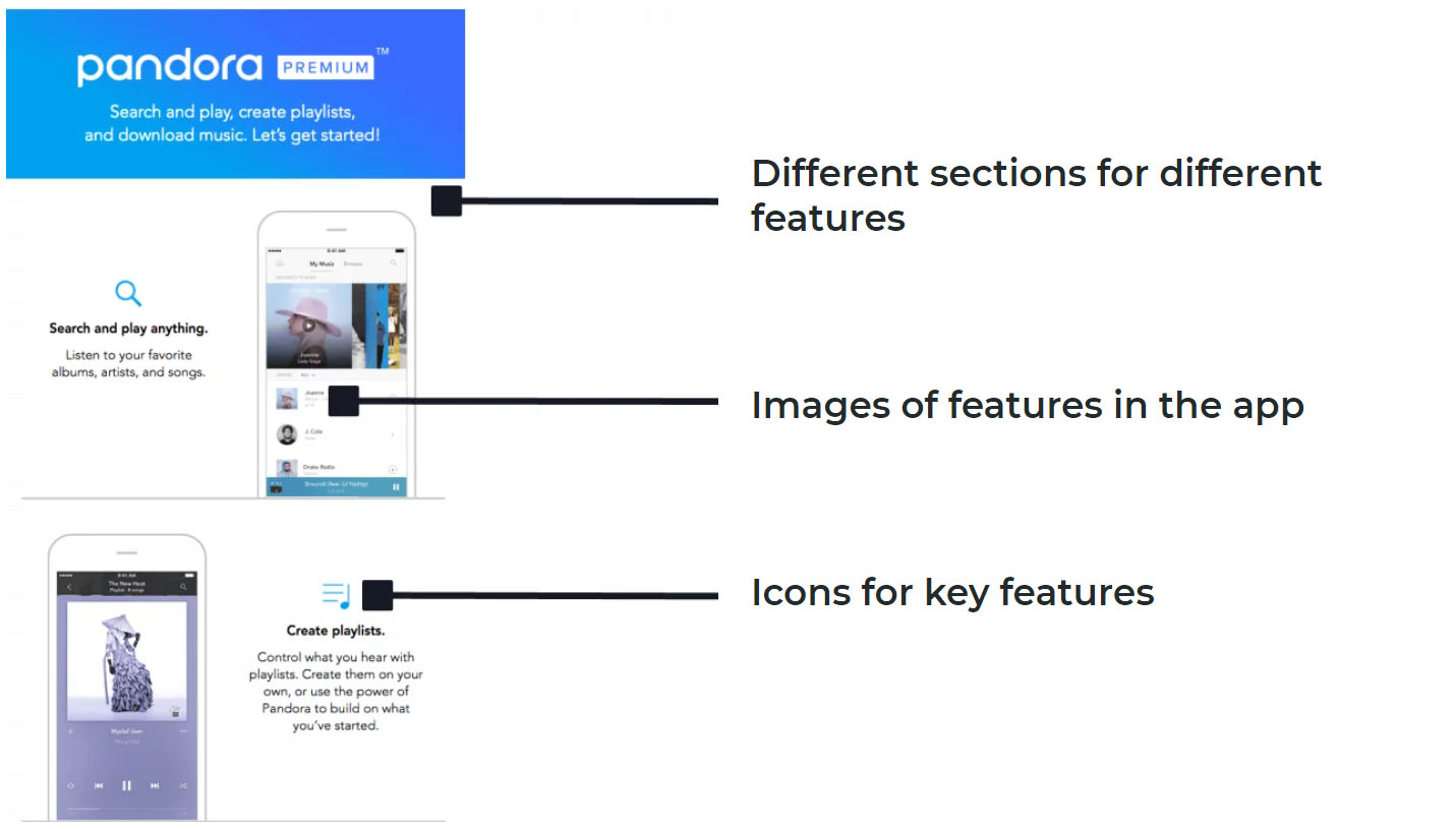
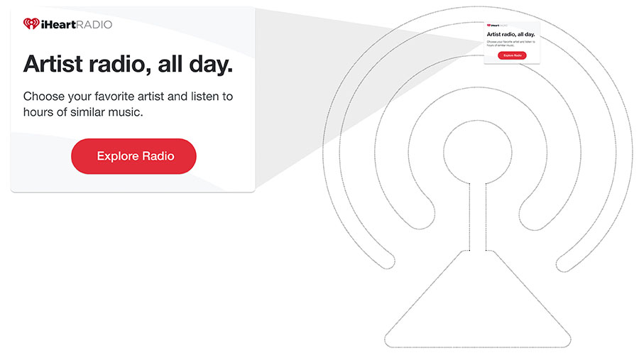
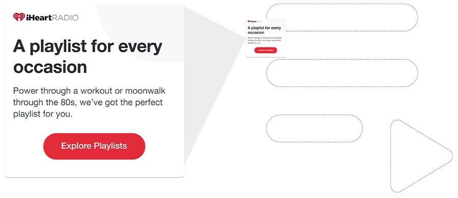
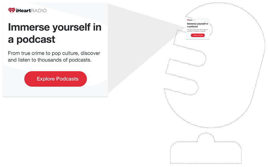
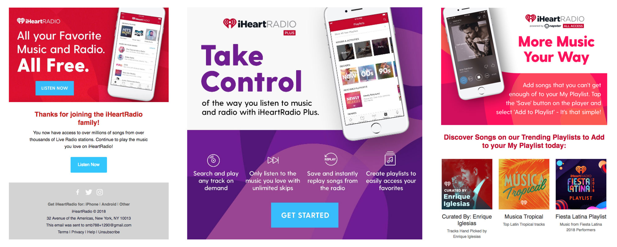
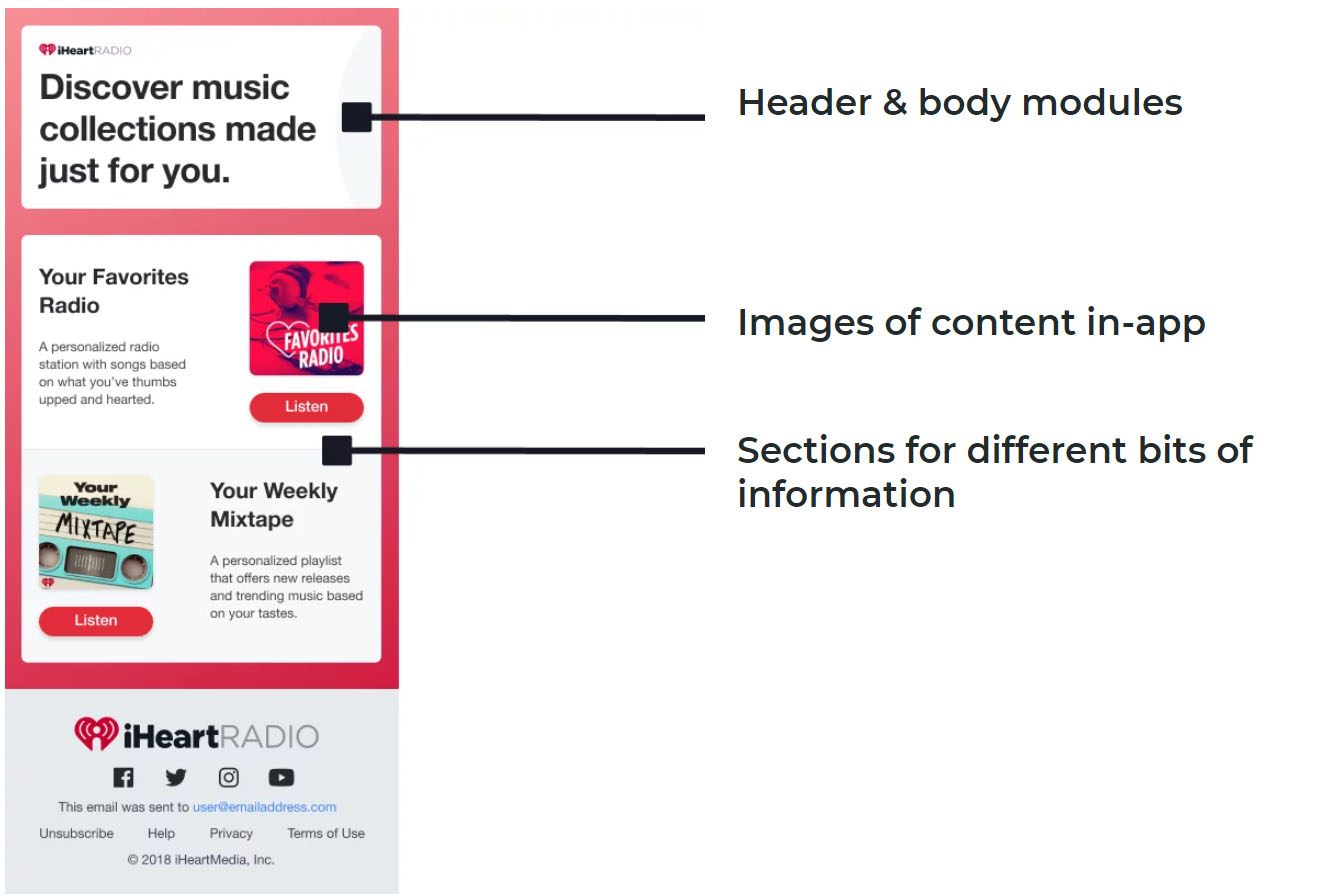
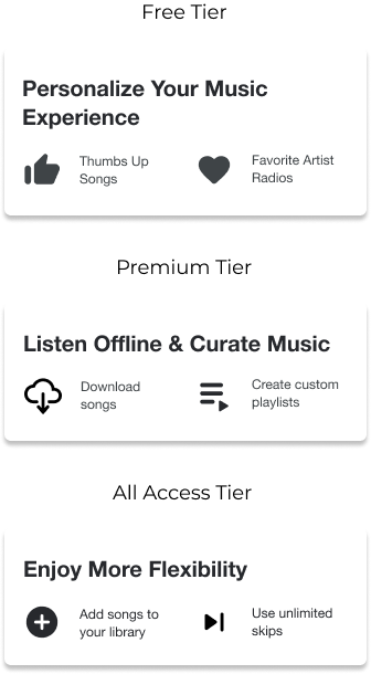
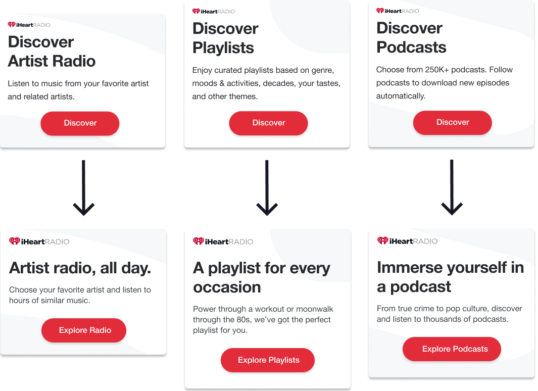
To avoid having different sets of emails for different subscription tiers, I decided to design the emails using interchangeable modules. The marketing team had already been using a modular approach for other types of emails so my solution allowed for a faster implementation. Taking inspiration from Pandora's emails, I broke up the modules into sections.


Adds a song to your library

Saves a station in your library

Informs song rec algorithm

Auto-downloads podcasts
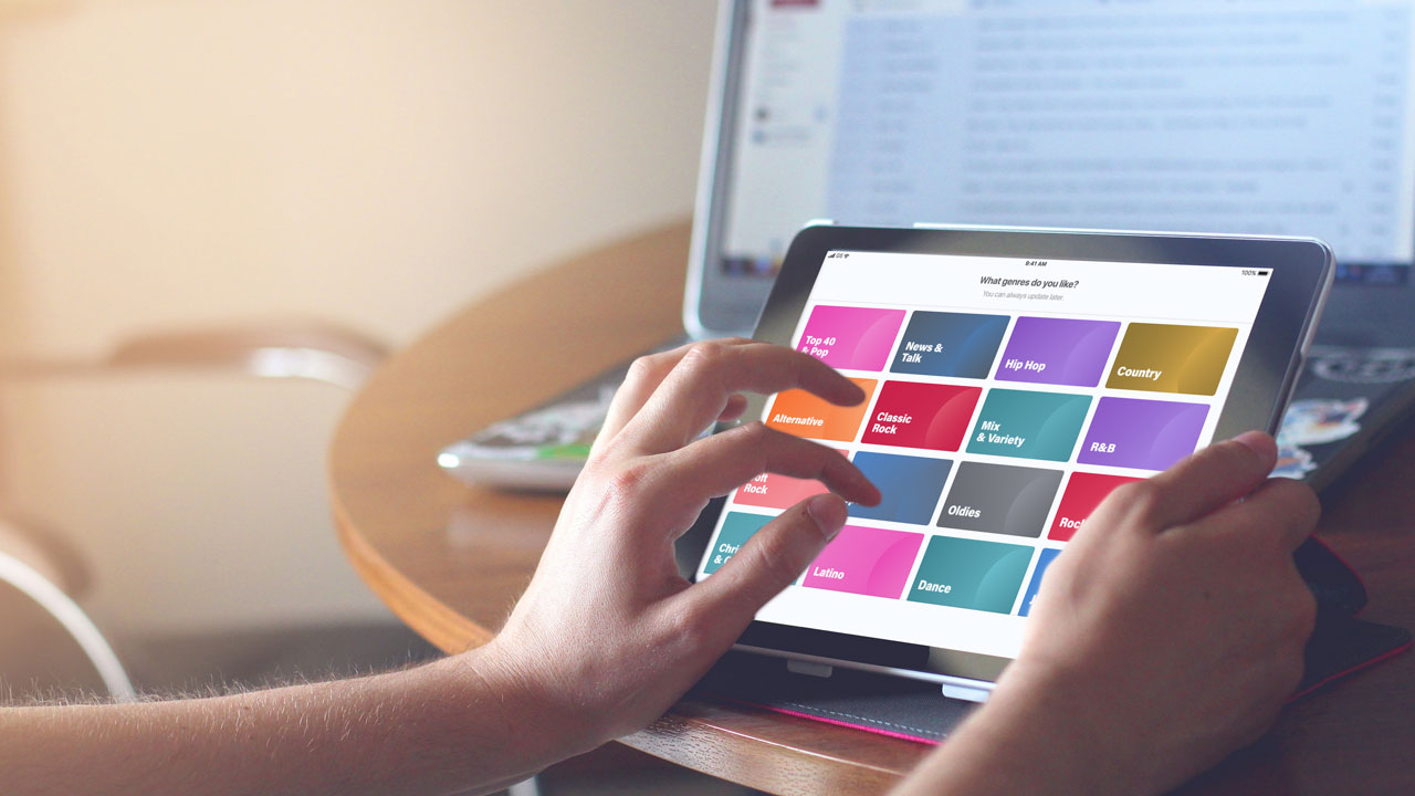
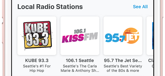
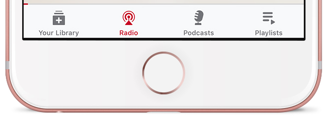
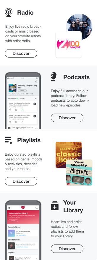
I set up a working session with the Marketing team to determine which content and features we wanted to highlight in the emails. In the meeting, I created a hierarchy of content and features based on their importance. In the first lifecycle email, we decided to focus on the content that appears in the navigation bar in the app.
In the main body of the welcome email, I presented the four key content types. Furthermore, I grouped the features based on the tiers they could be accessed in and presented them in interchangeable modules.
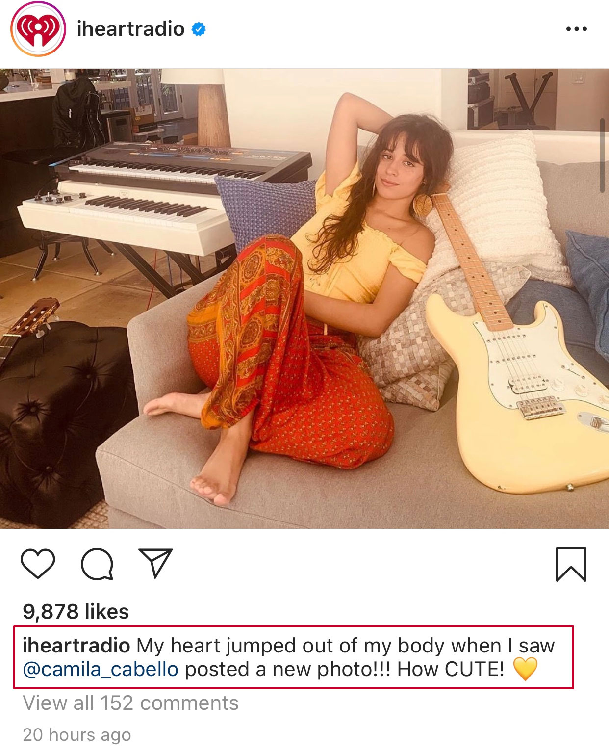
"My heart jumped out of my body"
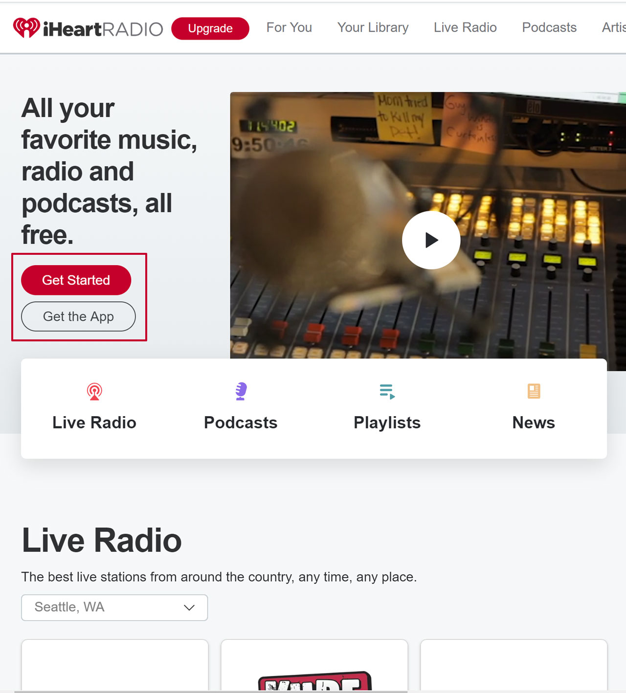
"Get Started"
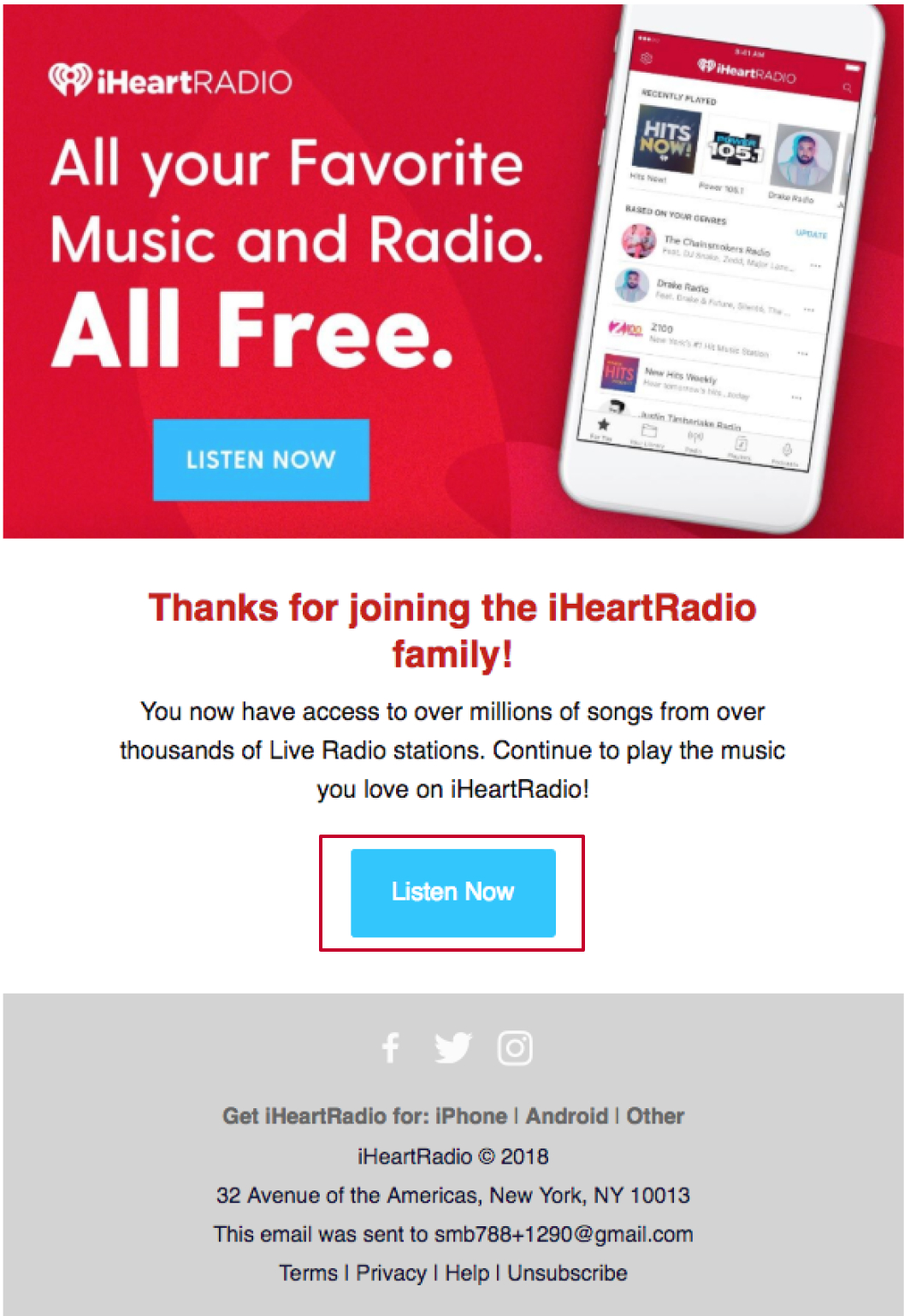
"Listen Now"
I designed and facilitated a working session with two marketing representatives, two product managers, two UX designers, and two mobile engineers. In the meeting, stakeholders sorted 150+ index cards with unique descriptors into three categories:
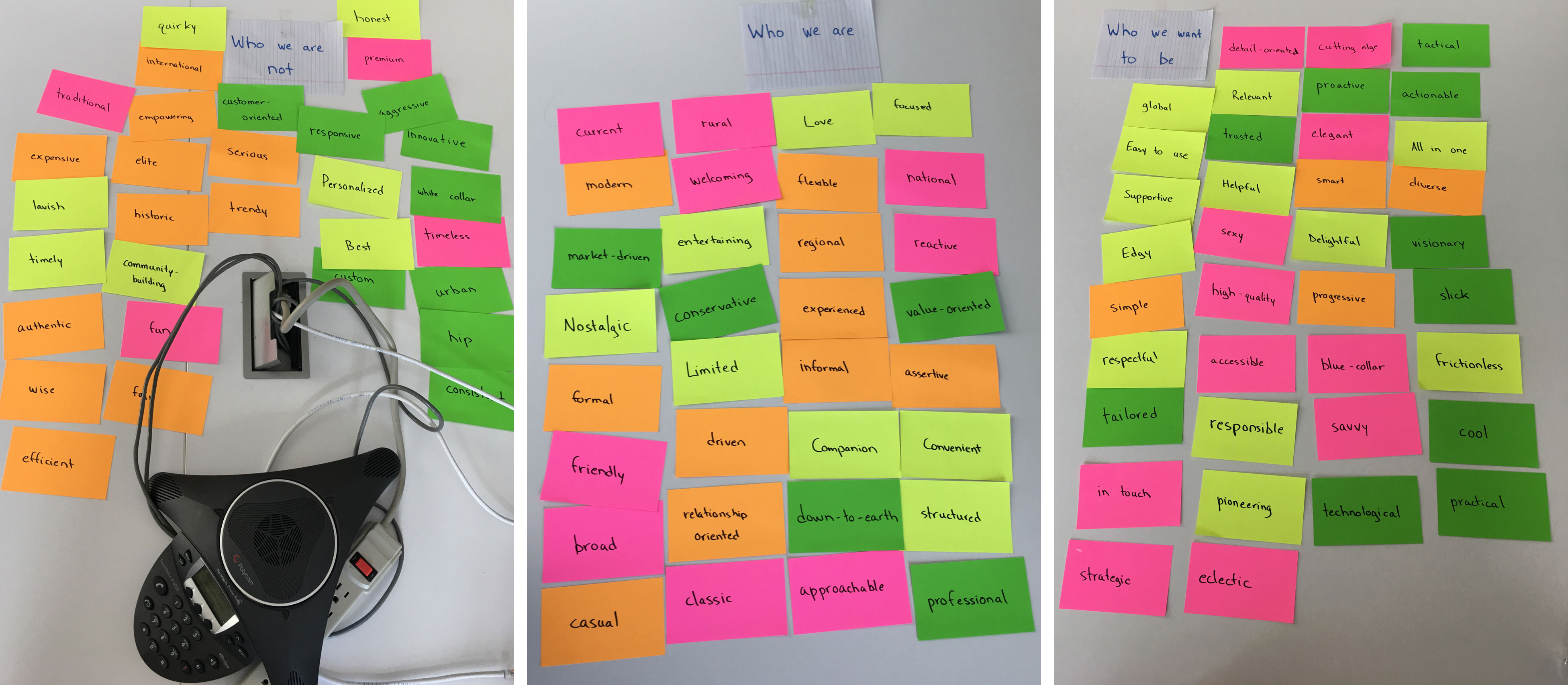
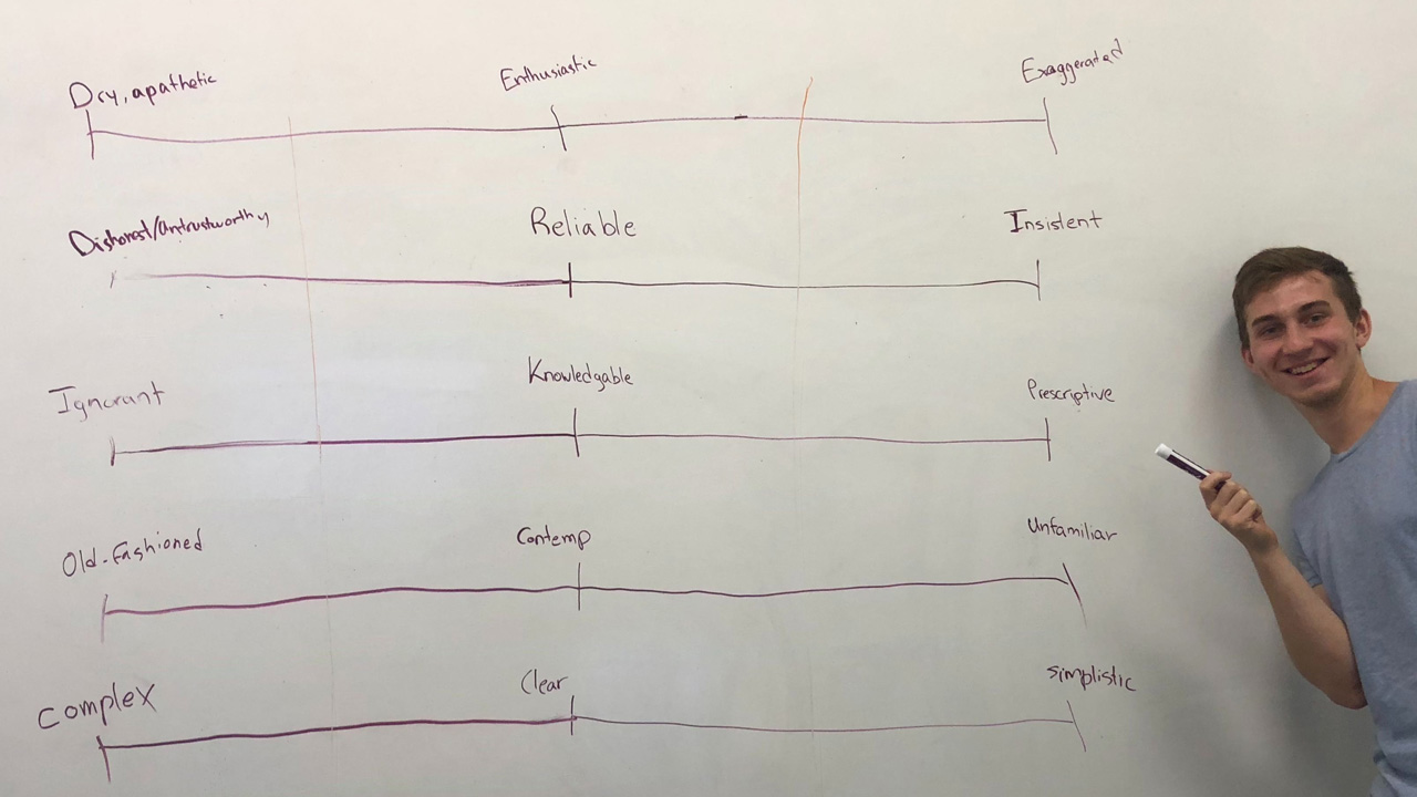
Synthesizing the results from the working session, my teammate and I created scales to help evaluate word choice for evaluating copy. The target tone is in the middle of the scales. These scale's have since been formally incorporated into iHeart's design system.
Using the tone and voice scales, we were able to write copy that conveyed a lot more personality and was more engaging.
I wrote test scripts, analyzed participant videos, and made improvements to my designs based on user feedback. My tests evaluated user's impressions and expectations for the emails.
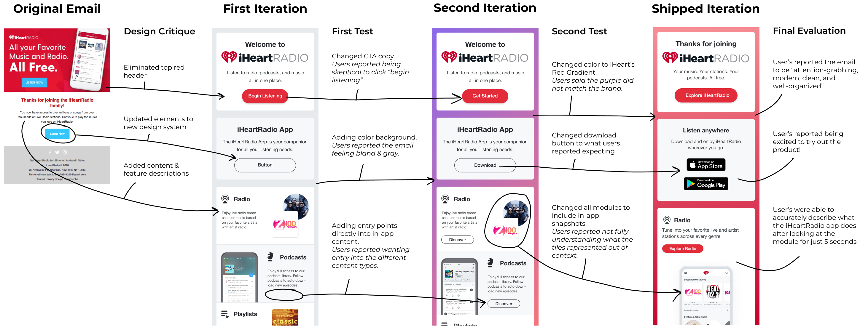
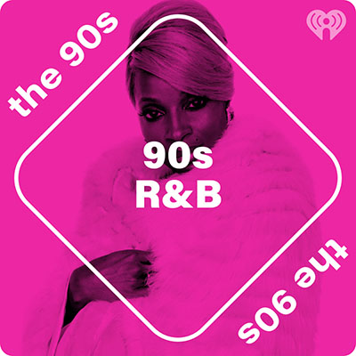
As a part of its design system update, iHeartRadio also shifted its tile art direction away from literal graphics.
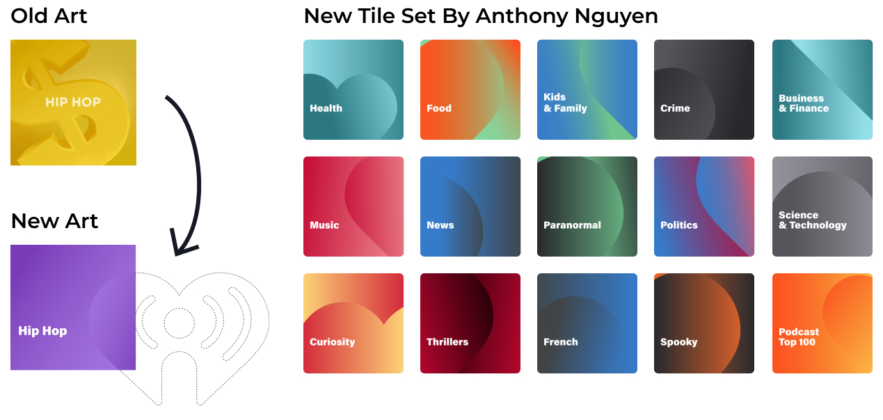
For the emails, I decided to use a similar approach in the background of the header modules to make them aesthetically cohesive with the tile art in the app.