A cross-platform solution for personalizing the iHeartRadio app to people's genre preferences.
How might we redesign the genre picker to accommodate new tile art in an accessible, engaging, and consistent way across all platforms?
People who are onboarding in the iHeartRadio app or customizing their preferences

UI Designer
Uta Knablein
Niral Parekh
Anthony Nguyen
Najah Mustafa
David Naeder
2 Weeks
August 2019

.jpg)
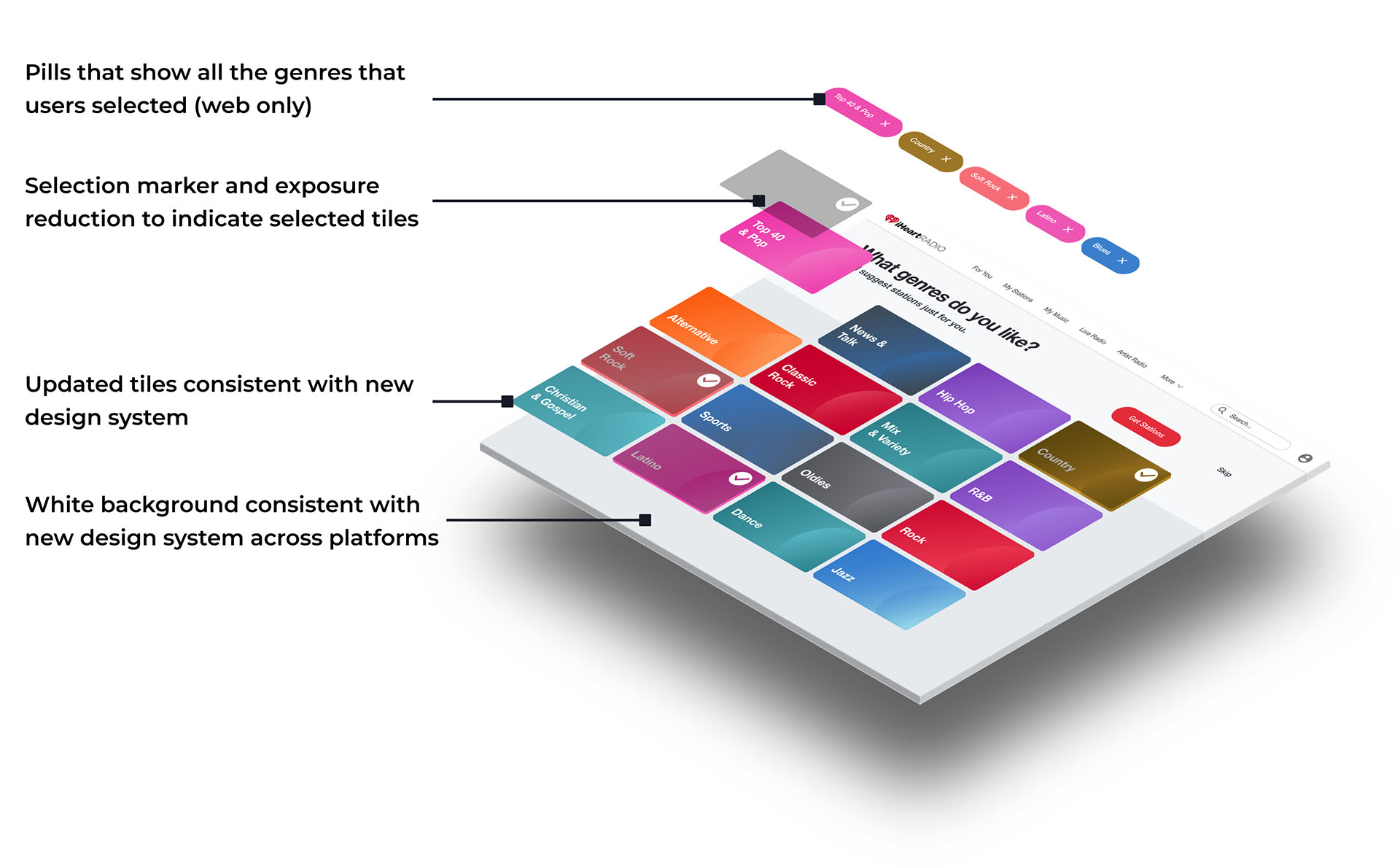
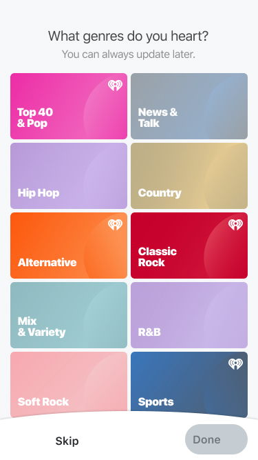
1. The new genre picker was visually accessible - it eliminated low color contrast ratios
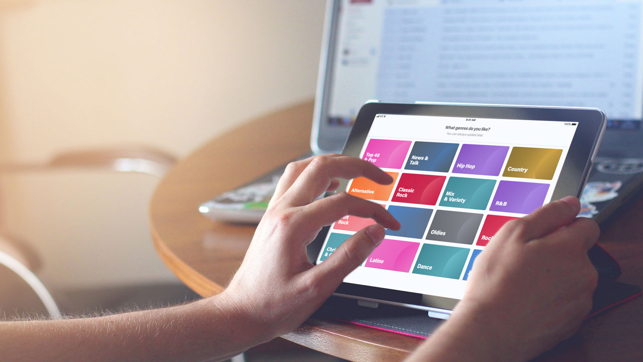
2. The new genre picker was consistent across all platforms creating a cohesive user experience
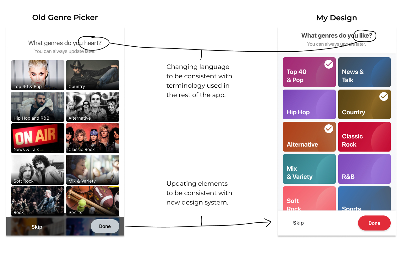
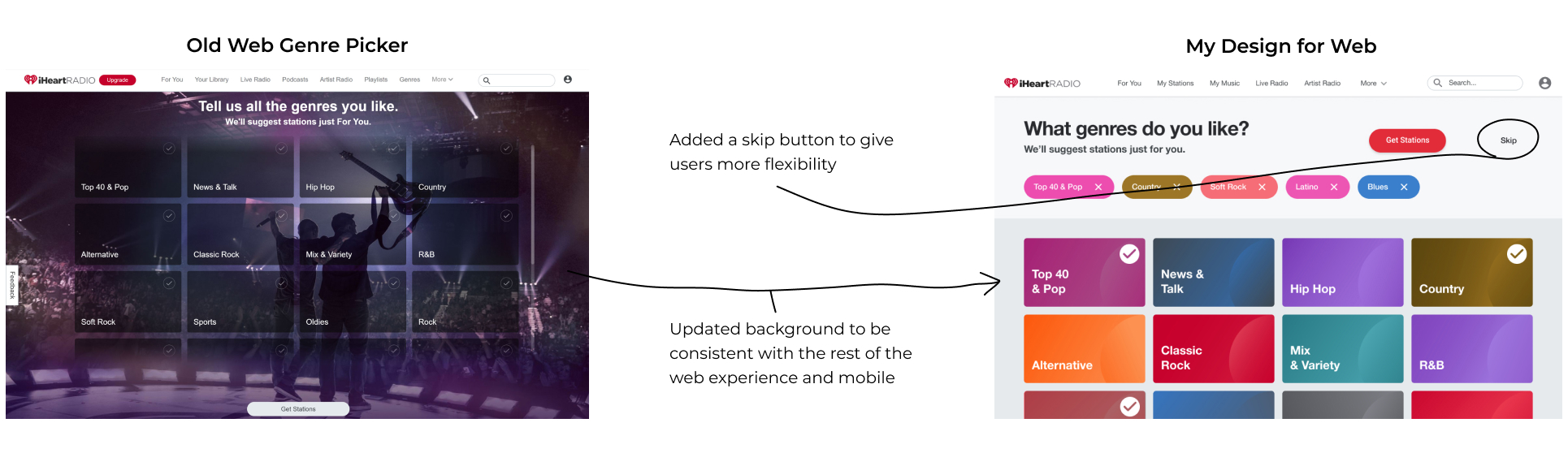
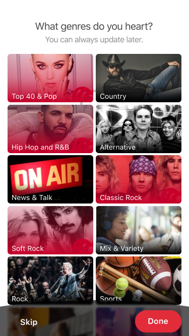
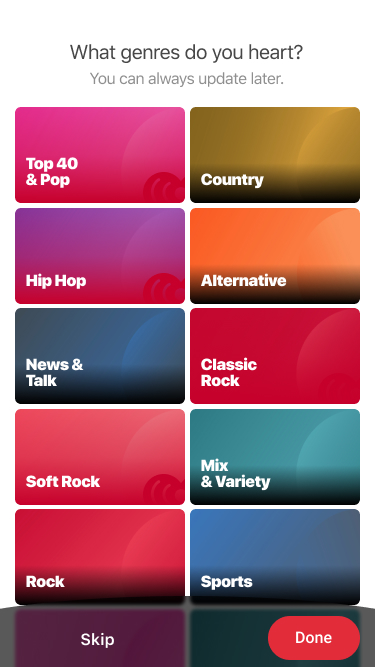
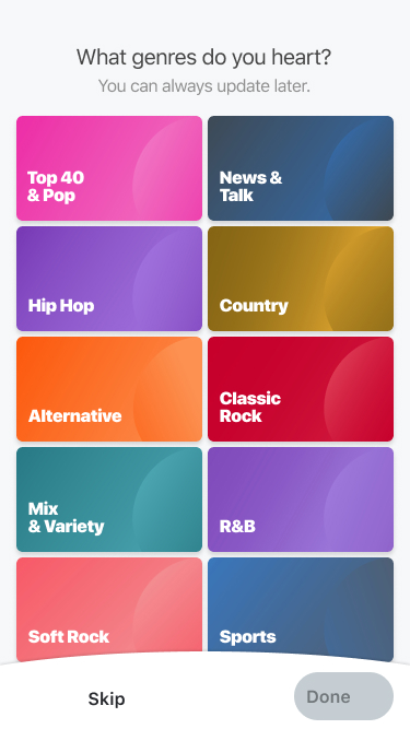
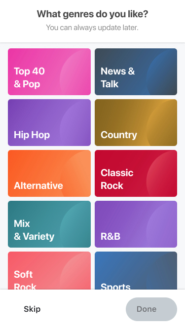
Early in the Summer of 2019, iHeartRadio updated its genre tiles from artist faces to abstract colors. New tile art by Anthony Nguyen.
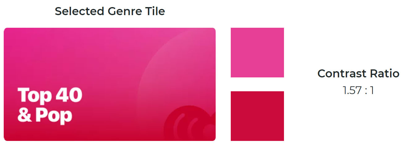
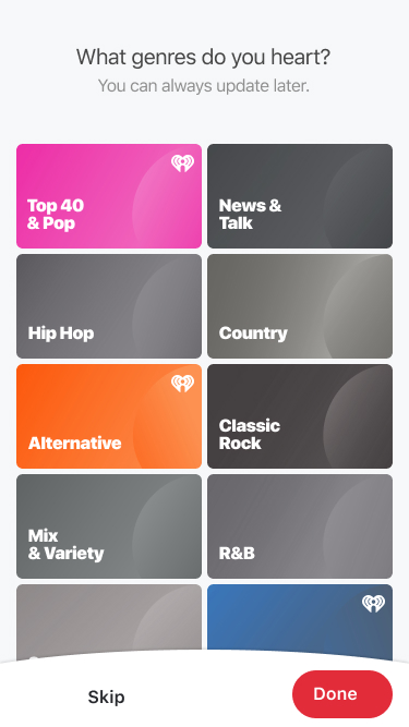
Once the new tile art was implemented, the transparent red gradient that indicated a selected state was no longer visible on certain tiles. The target contrast ratio is 3:1.
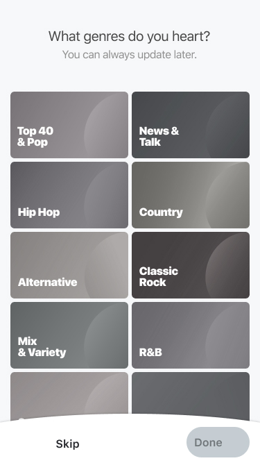
Desaturated tiles look inactive. It is unclear if they're clickable.
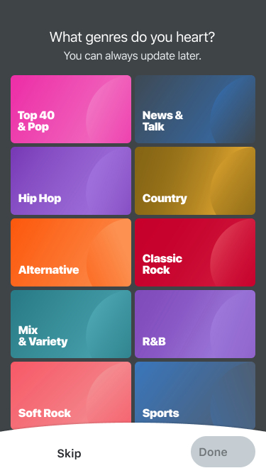
White frames provide good contrast but dark background doesn't match design system and is inconsistent with the other screens.
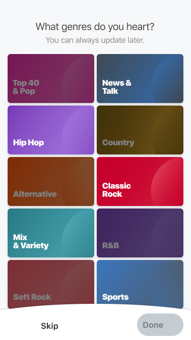
Text is hard to read at low exposure. Low exposure doesn't associate with "selected" because it appears inactive.
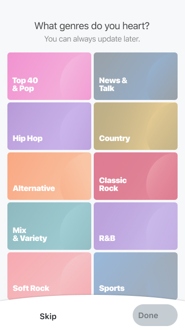
Transparent tiles look inactive - unclear if you can click on them.
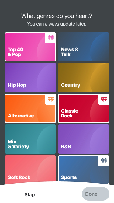
Ultimately, I settled on using markers and exposure to indicate select states.
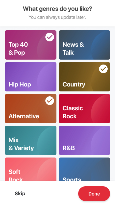
Markers stands out and are visible on any color tile. When paired with a lower exposure, it's easy to tell apart selected and unselected tiles.