


InTune
Connecting radio hosts with their listeners through messaging.
Connecting radio hosts with their listeners through messaging.

How might we design a multi-functional messaging & calling platform for radio hosts that supports interactions with their audience and creates a personal connection with listeners?
Radio hosts at top 40 radio stations

UX & UI Designer
UX Researcher
Maya Klitsner
Zoe Escalona
January - March
(3 Months) 2020

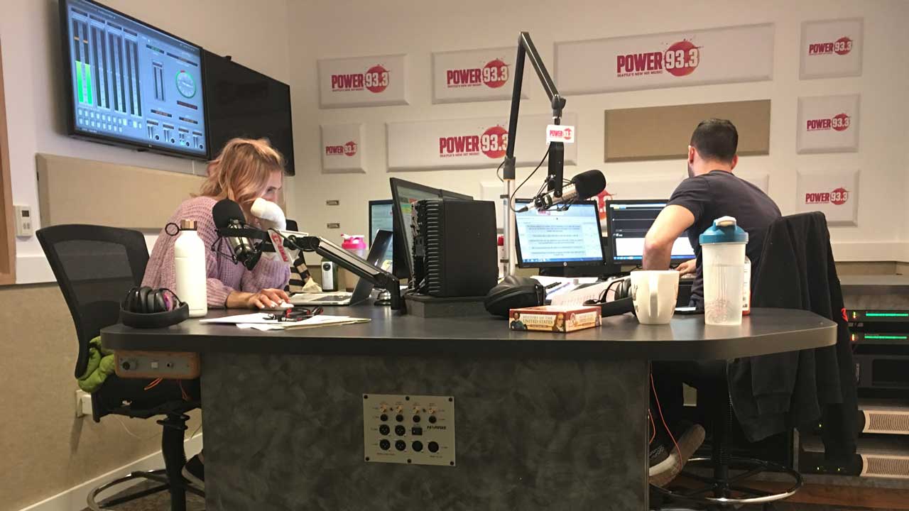
Radio hosts at iHeartRadio stations in Seattle receive listener-sent text message through a platform called HipCricket. This platform is frustrating to use because it fails to support emoji use, message threads, and other functionalities radio hosts need to do their job.
To better understand the goals, pain points, and needs of radio hosts, our team conducted a contextual inquiry session at a Top 40 Radio station where we observed how they work and then interviewed them about their practices.
I assisted with writing interview questions and facilitated, took notes, transcribed, and coded one of the three interviews that we conducted. The research revealed user characteristics, desires, goals, and pain points.
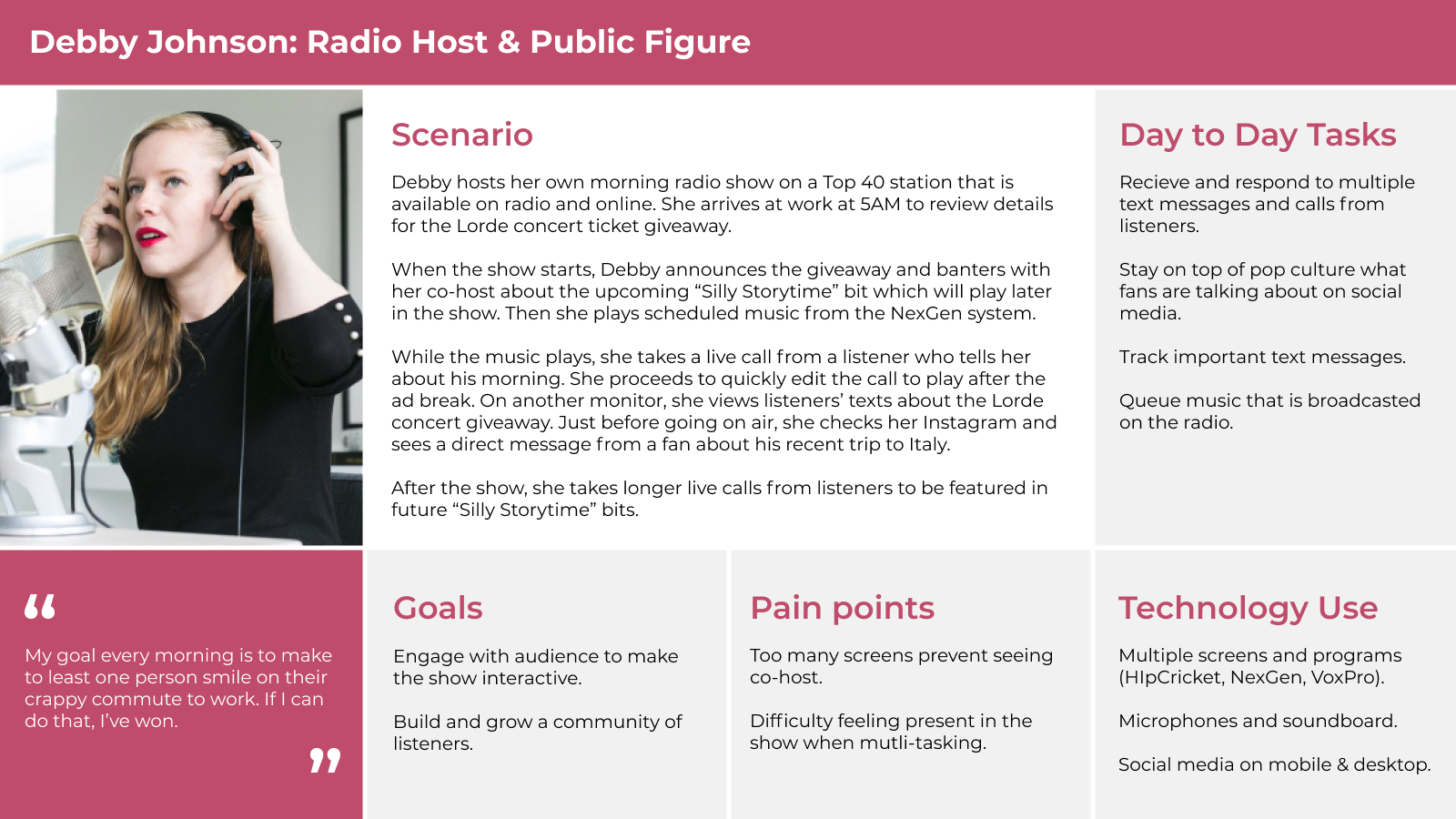
We organized interview transcript codes and quotes from the interviews in a preliminary persona.
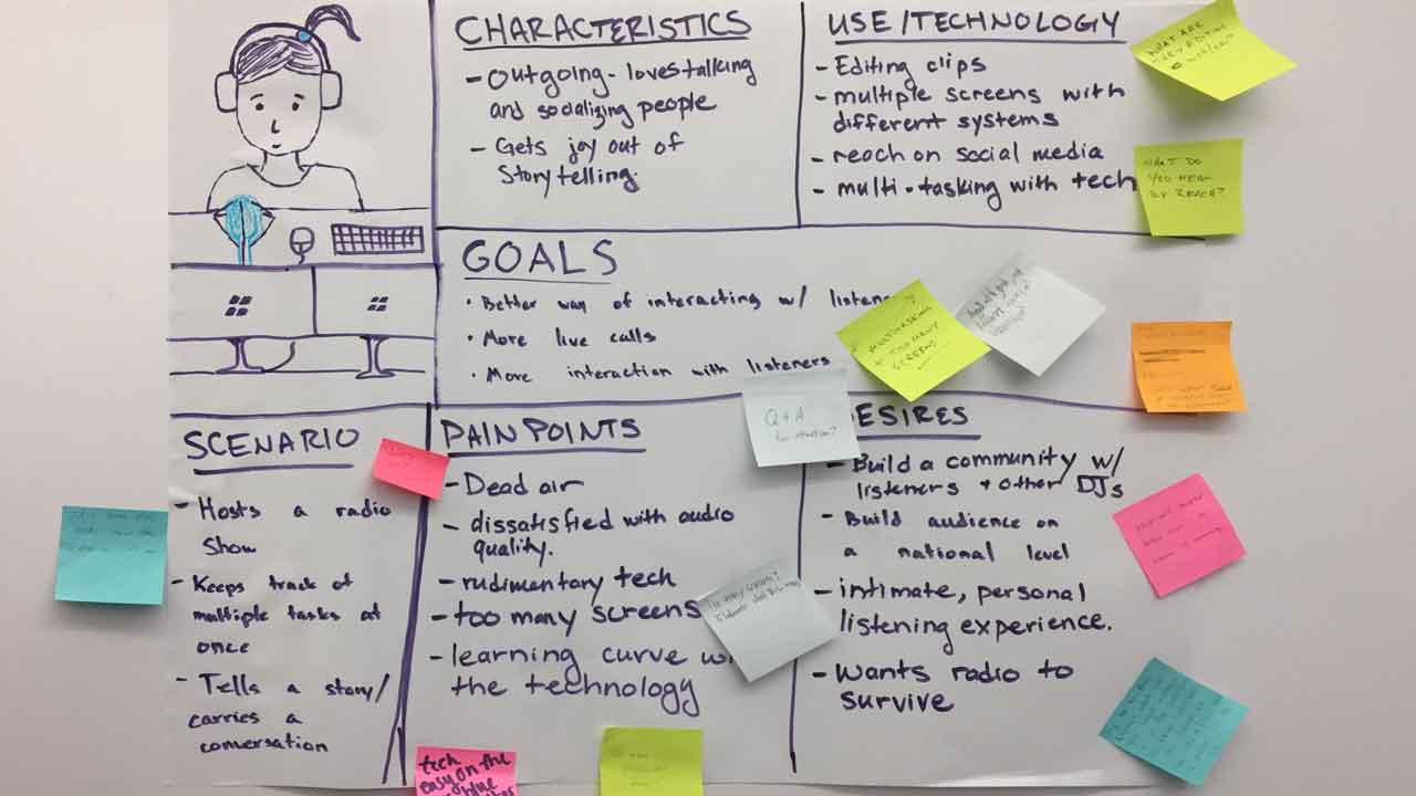
The resulting persona helped formulate design requirements and guide the rest of the project.
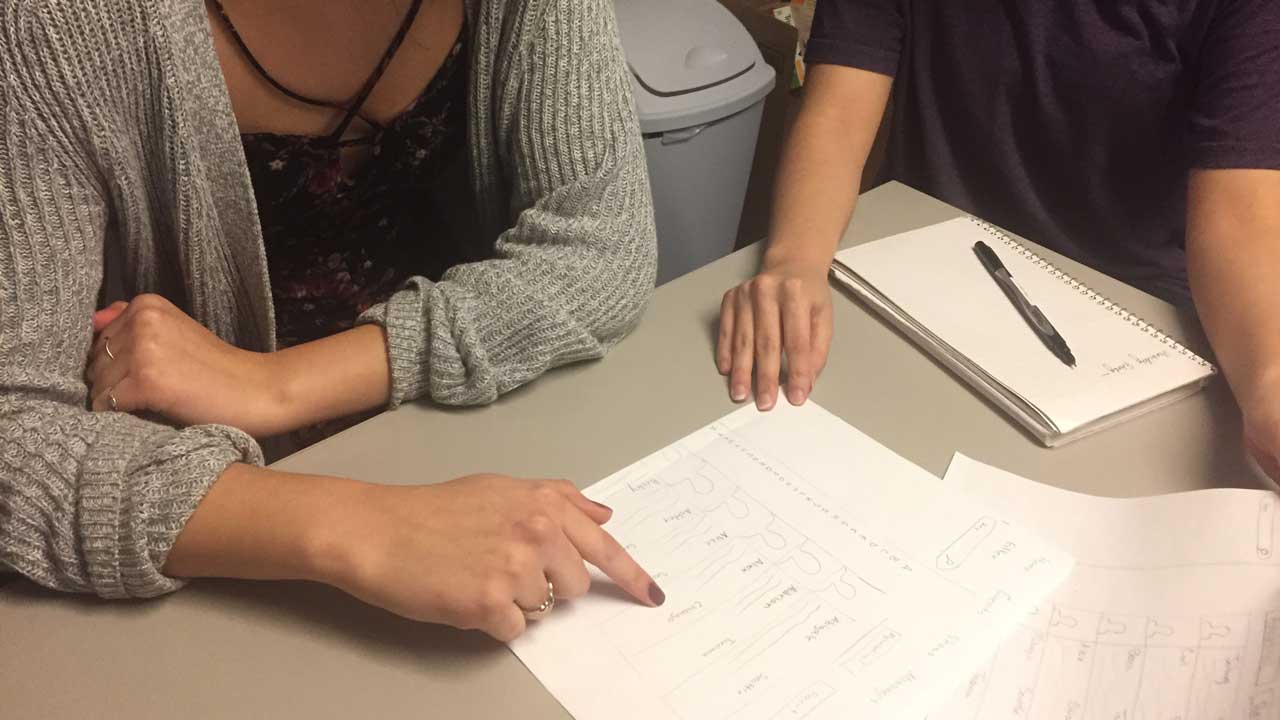
I helped design and finalize the following journey map, which gave us an understanding of critical touch points within the hectic two hour period that radio hosts do their show.
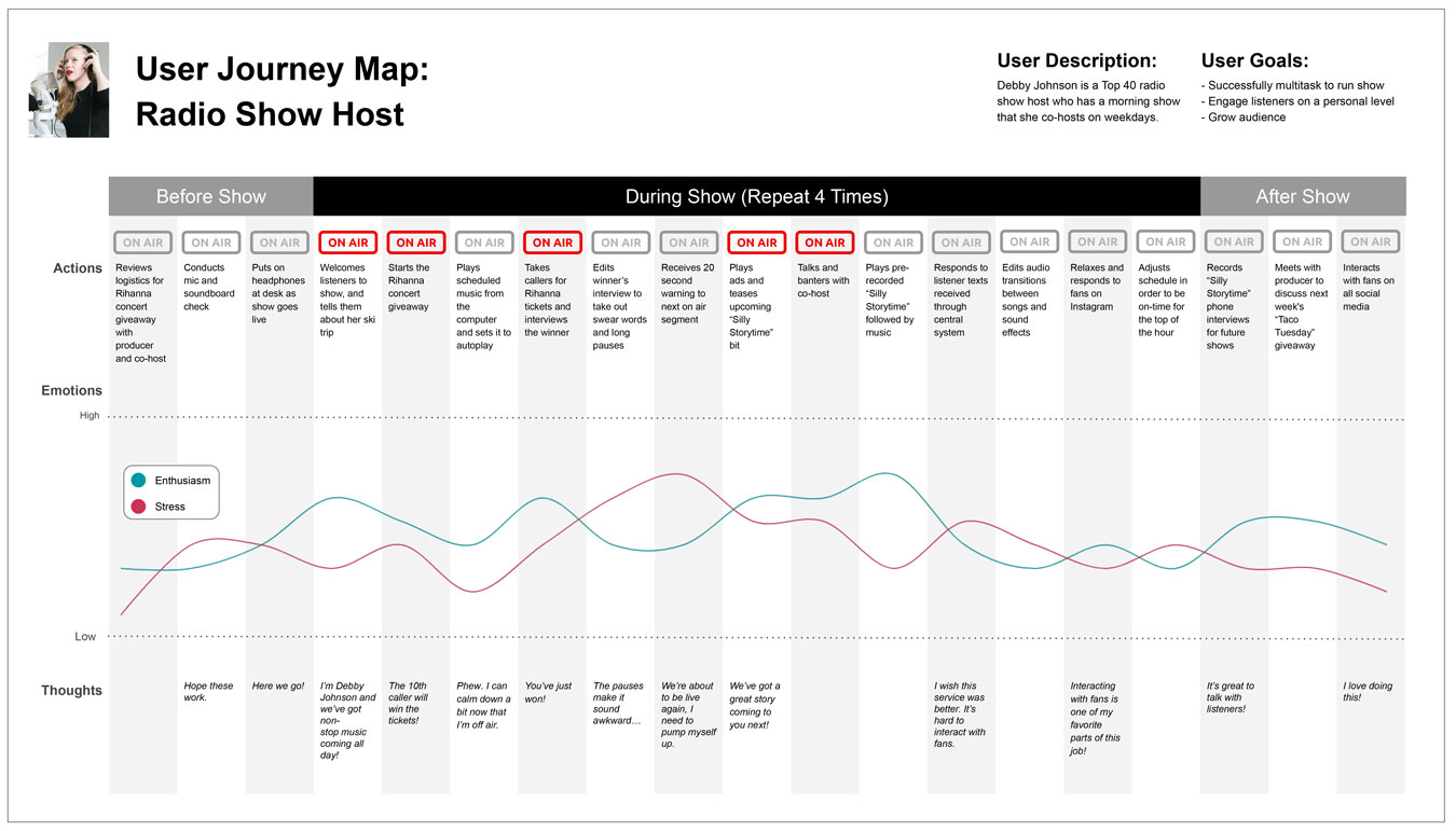

Host receives 20 second warning to next on-air segment while tracking texts

Talks and banters with co-host while scrolling through texts
Responds to listener texts received through central system
1. Highest stress points occur when user is multitasking responsibilities that come right before, during, and right after on-air segments
2. Highest stress point occur when user is multitasking managing texts with other tasks
Solutions that automate tracking and managing texts would reduce the amount of tasks hosts have to juggle, allowing them to focus on their conversation.
Based on the results of the research synthesis, our system must:
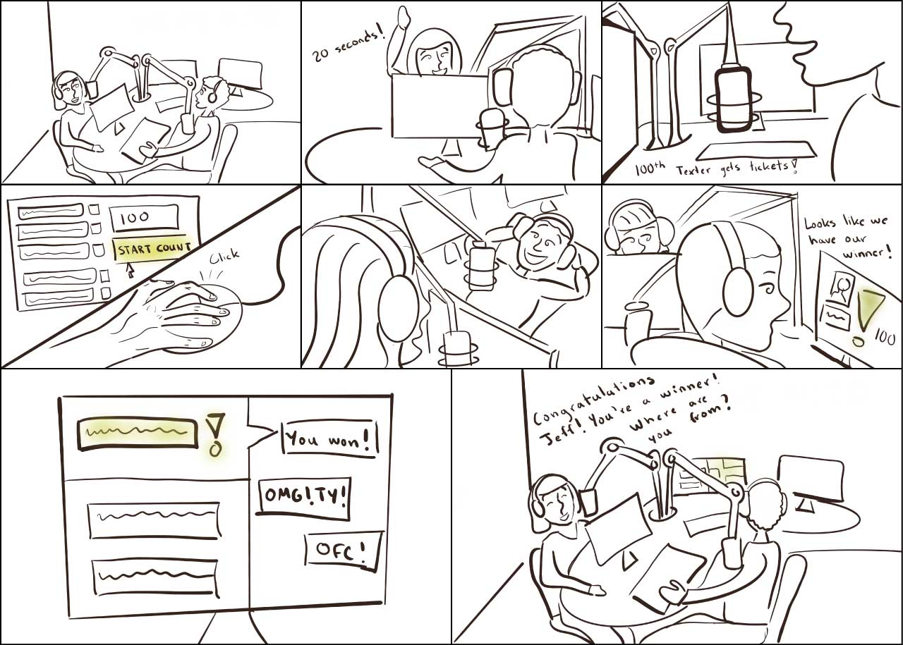
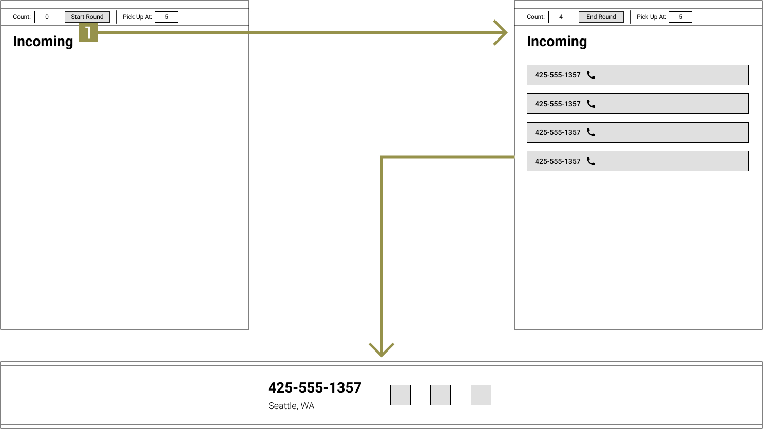
To contextualize our design thinking, I created a storyboard illustrating how users might interact with a potential solution. I explored how users might interact with an automated message tracking feature for contests and giveaways (Design Requirement 3).
After storyboarding several solutions, we brainstormed content that addressed our design requirements and sorted it in an IA. I created a digital version of our IA in Lucidchart based on our notes and discussions from the team IA brainstorm session.
.svg)
After planning out our IA, we began wireframing our interface. I created interaction flows to make sure that it met all the key design requirements that we established earlier based on the results of the user research.
To test our IA and our interaction flows, my team created quick paper prototypes based on the wireframes and tested them. We asked participants to perform four key tasks. I conducted and analyzed one of these usability tests. Based on the results of our usability test, we iterated further on our designs, improving in areas where users had difficulty completing a task.
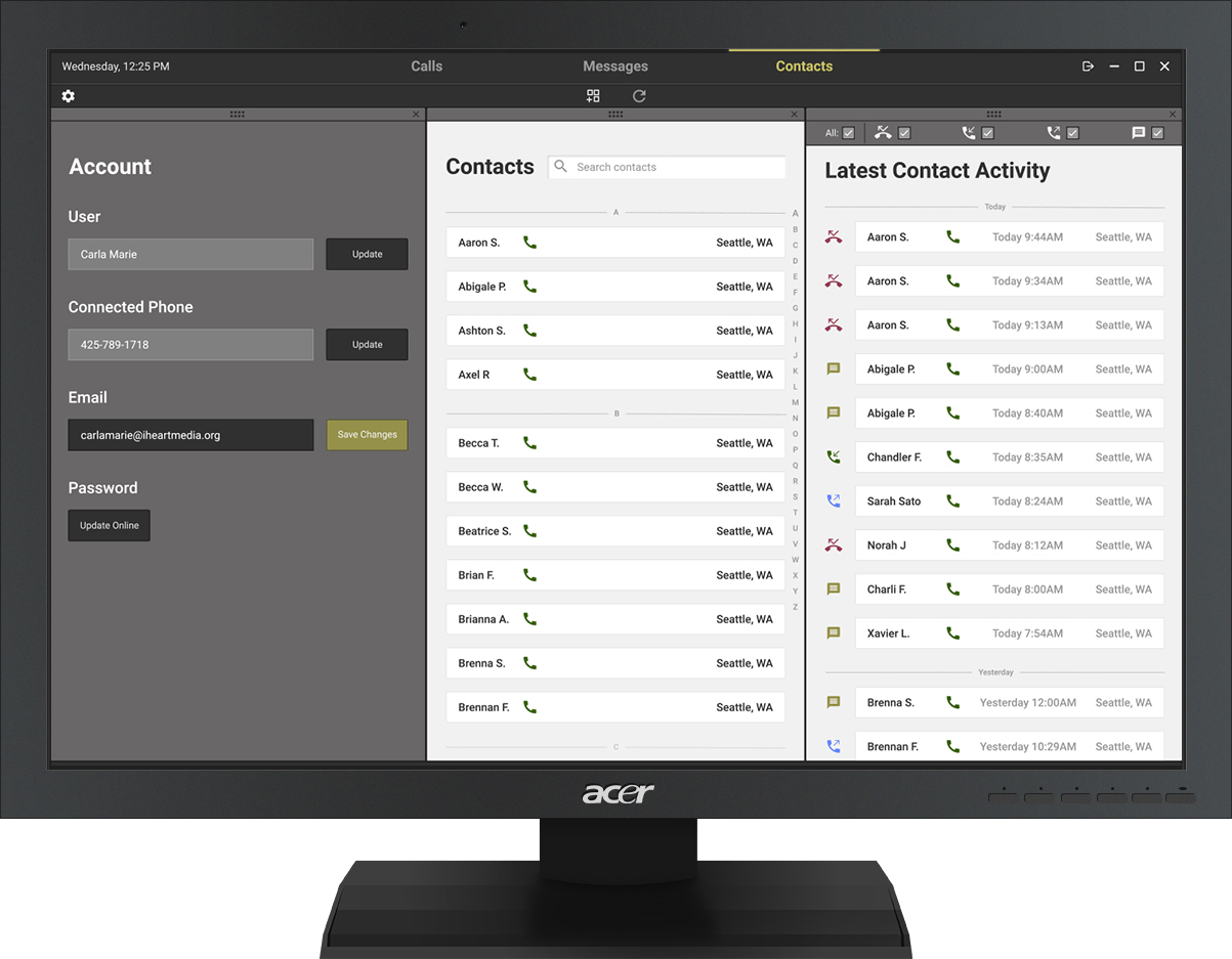
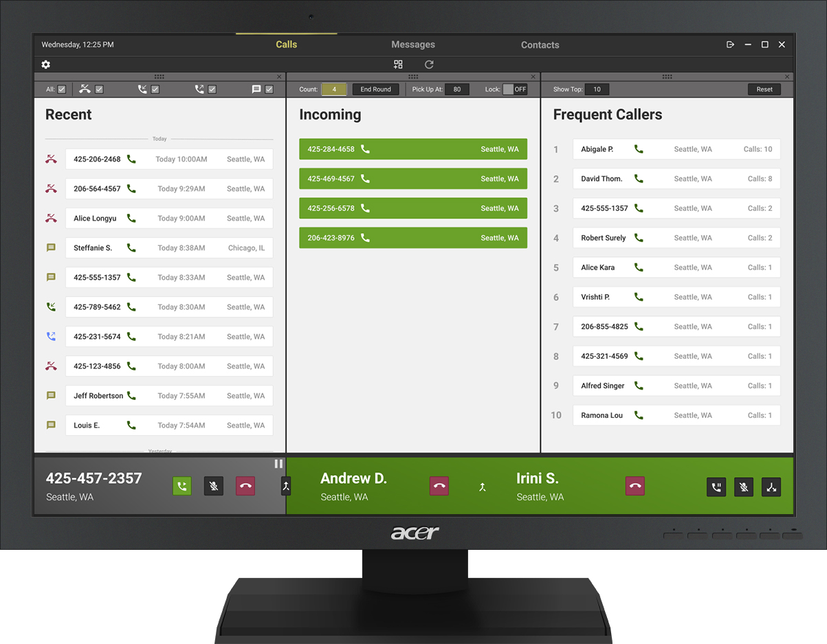
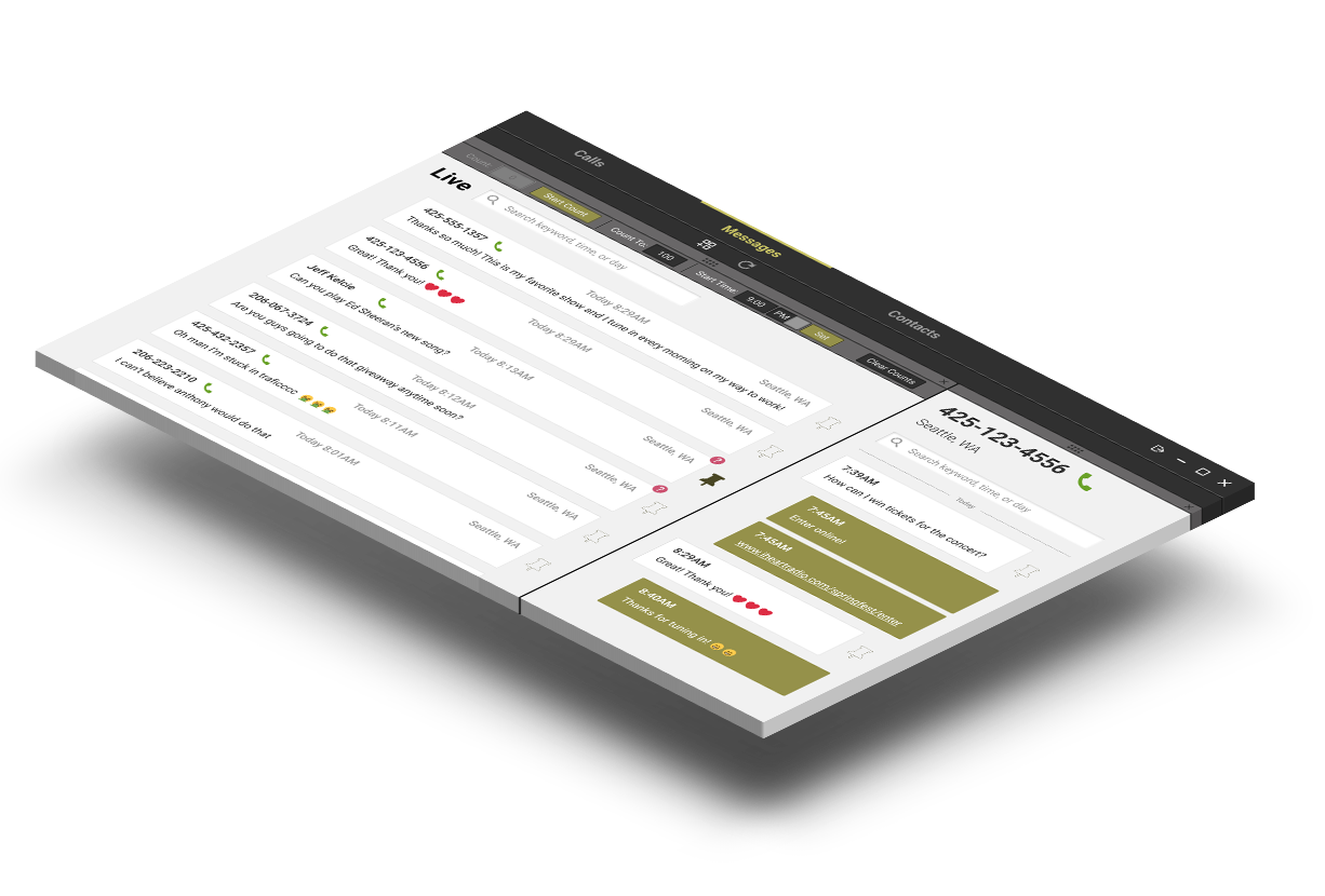
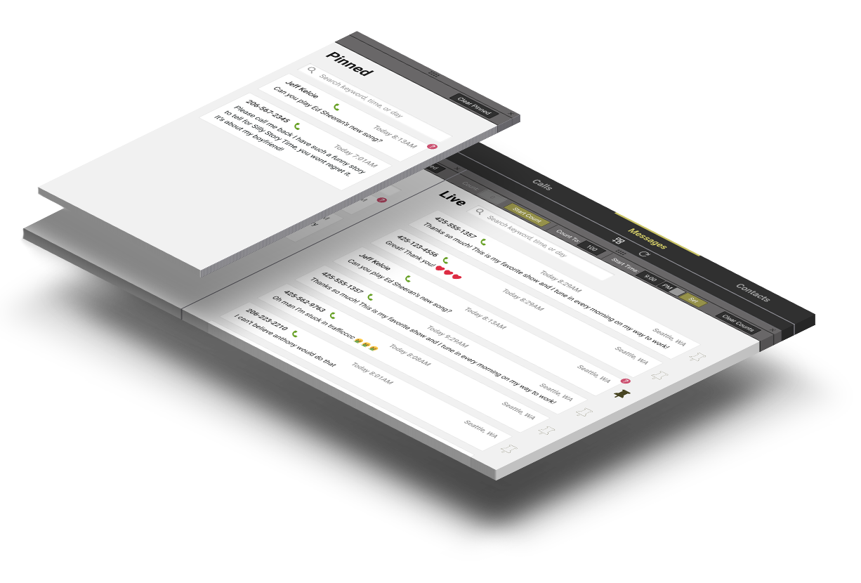
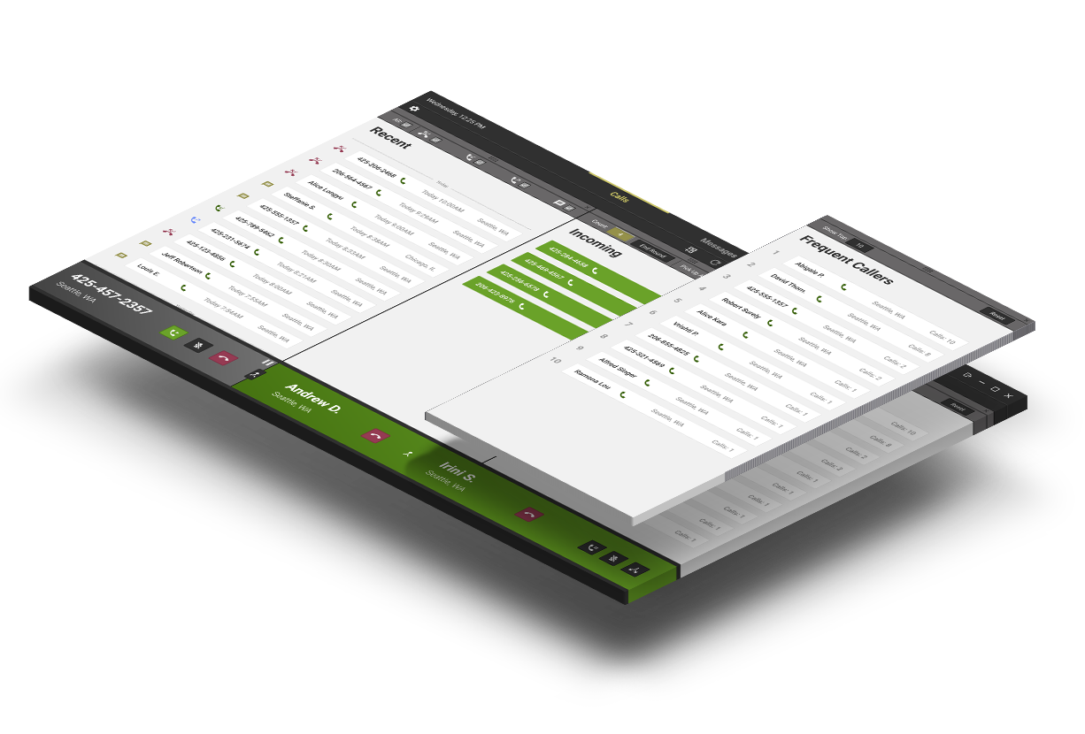
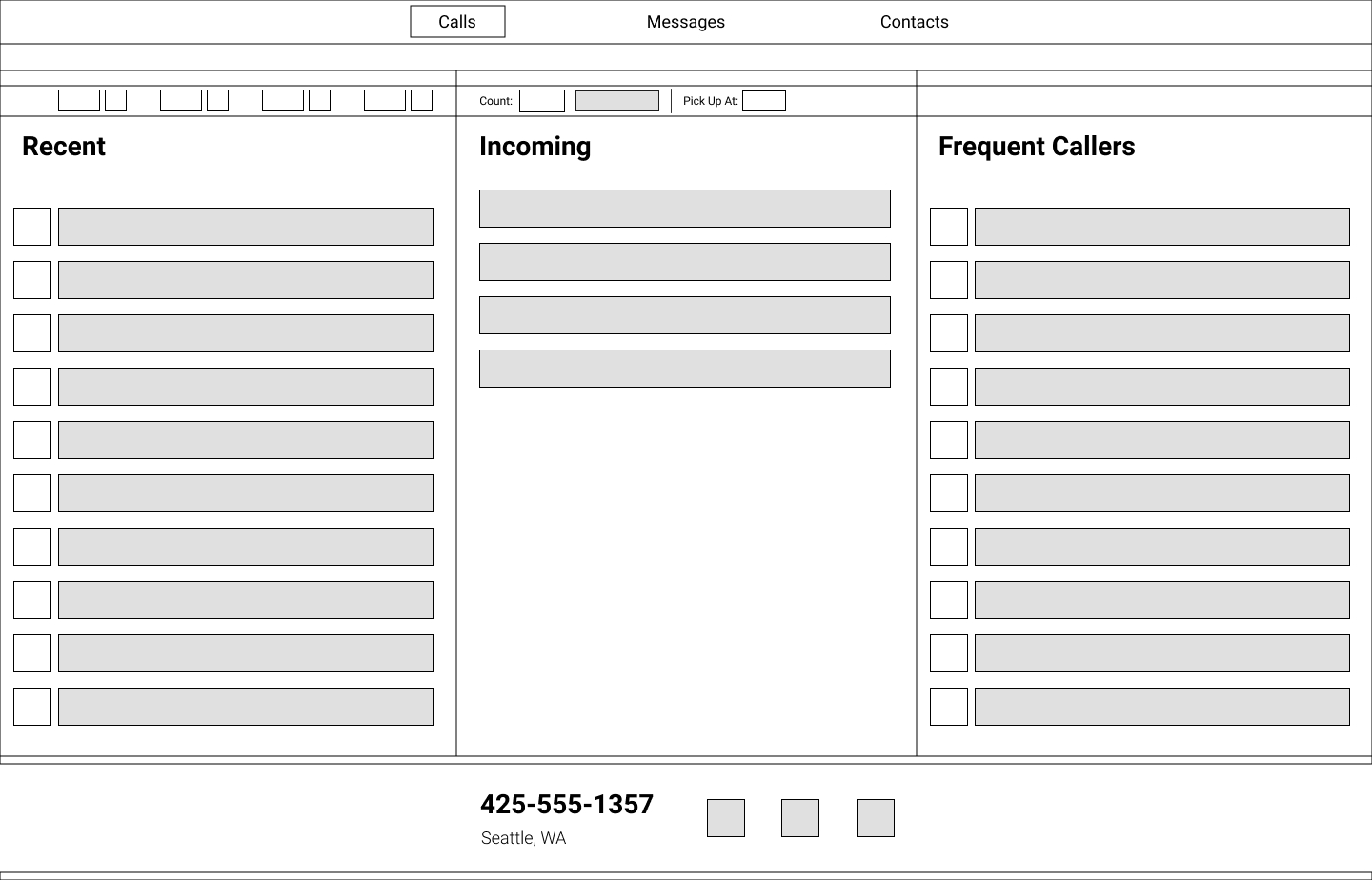
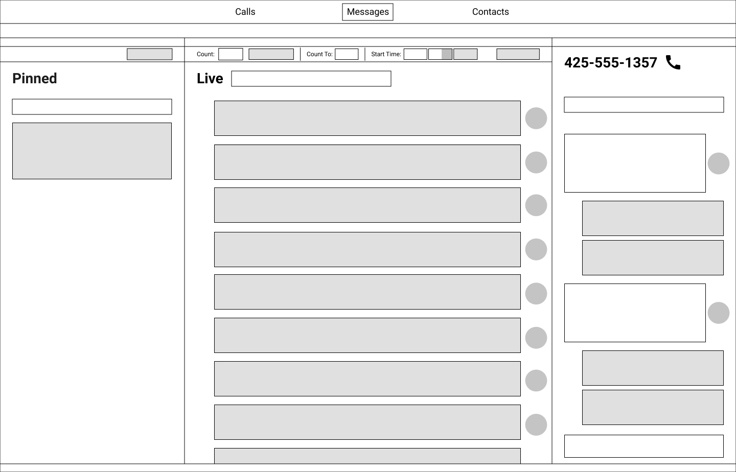
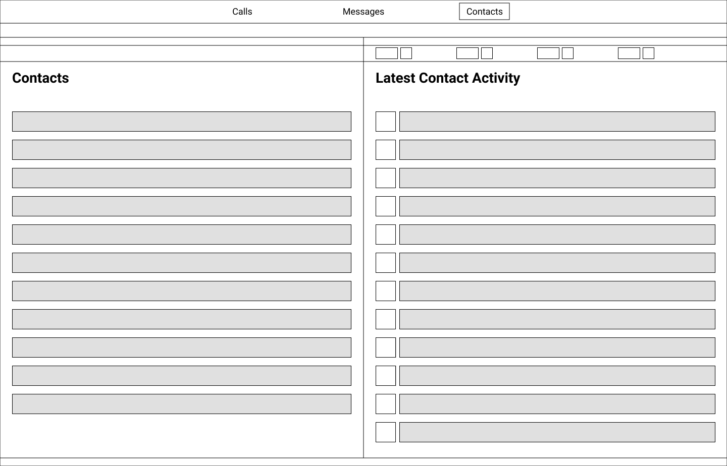
Each of the three main views has a default configuration but can display any module from the other views. Users can move & resize modules to their preference.
Intense multitasking and desire for less computer screens in studio.

The interface uses a gray-scale color system that features one accent color that highlights the most important features.
Users reported severe eye strain after looking at three monitors all day. To reduce eye strain, our interface is predominantly gray.
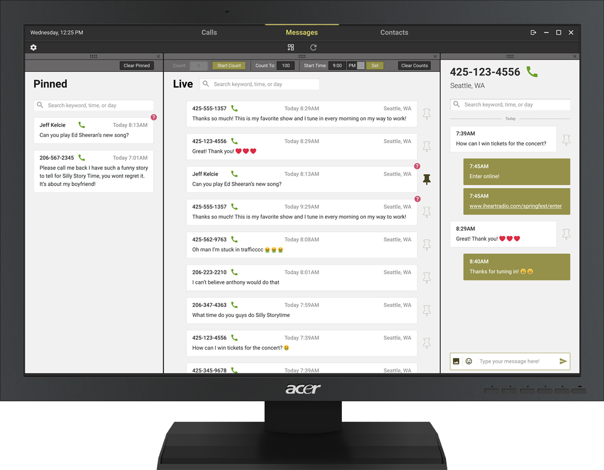
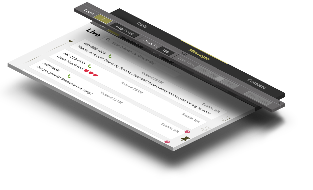
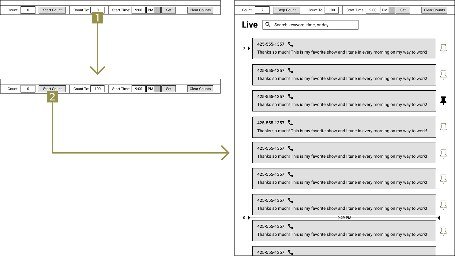
The interface enables hosts to plan ahead and schedule message counters for giveaways. By setting counters, hosts can focus on talking to each to each other rather than keeping track of time and messages.
Tracking text messages while transitioning from on and off air segments is stressful.


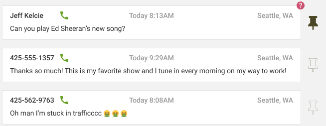
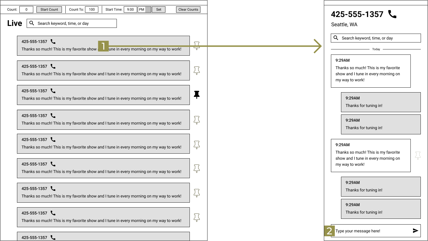
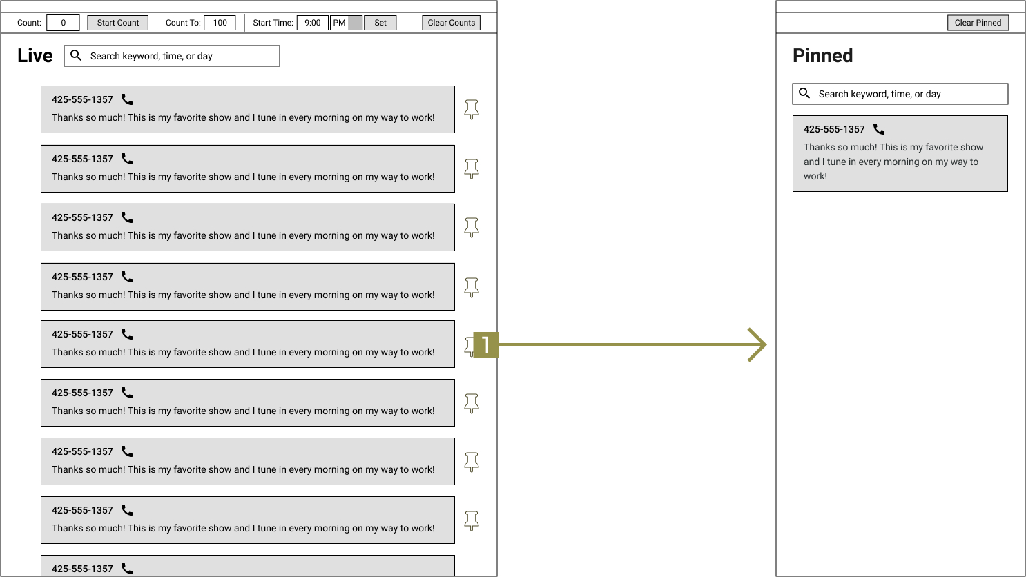
The systems recognizes when listeners send questions and marks them with a priority signifier. This allows hosts to quickly scan for messages that prompt a response that they haven't addressed yet.
Engage with audience to make show interactive.
