


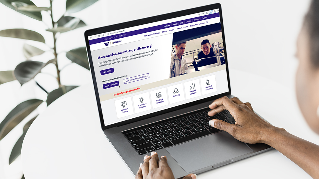
CoMotion Website
Helping University of Washington (UW) researchers commercialize their innovations.
Helping University of Washington (UW) researchers commercialize their innovations.
.jpg)
How might we design CoMotion's website to encourage UW Researchers to commercialize their innovations through CoMotion and connect them with the services they need throughout their journey?
UW Researchers
Innovation Managers that consult UW Researchers

Lead UX Designer
Usability Tester
Donna O'Neill
Greg Schlimm
Debra Bouchegnies

October 2020 - Ongoing
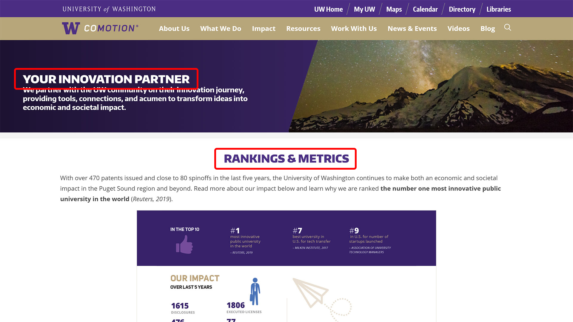
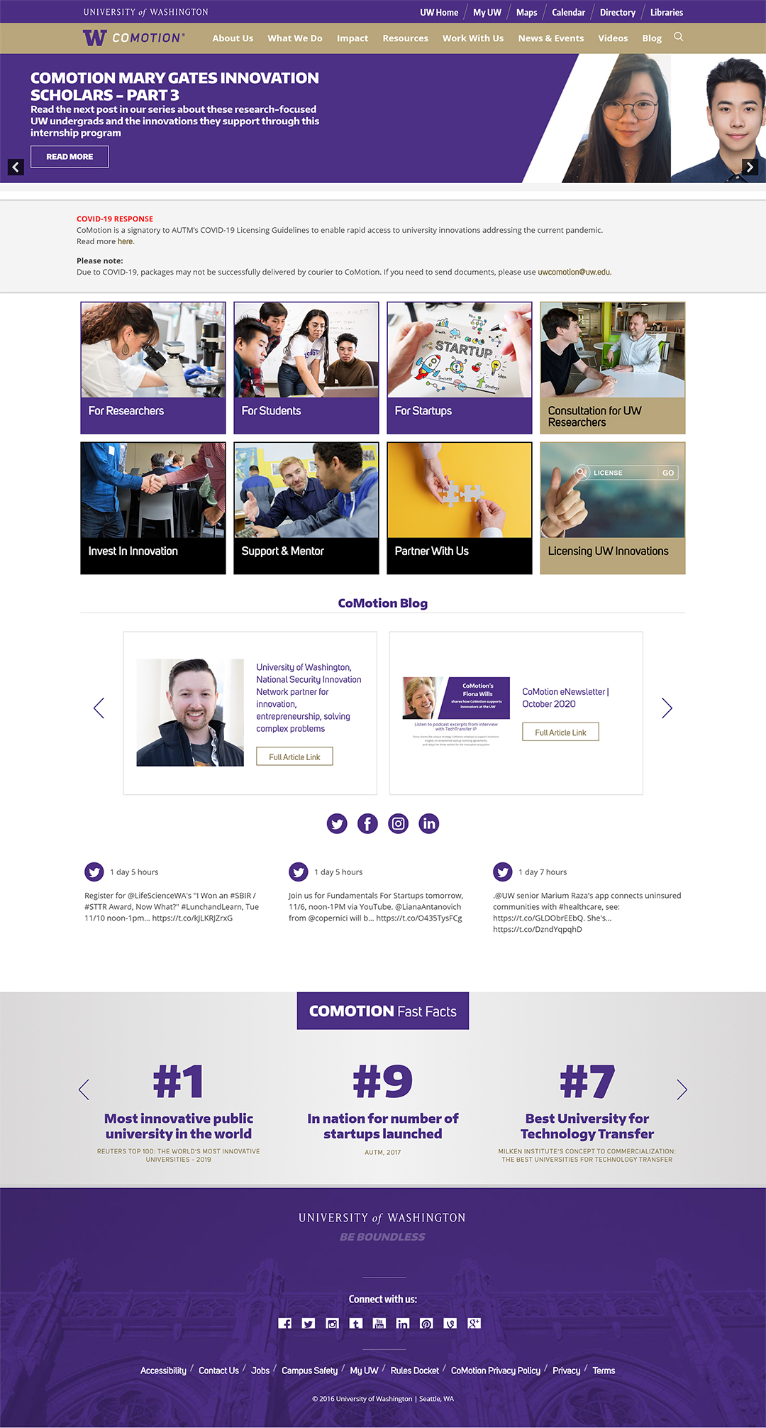
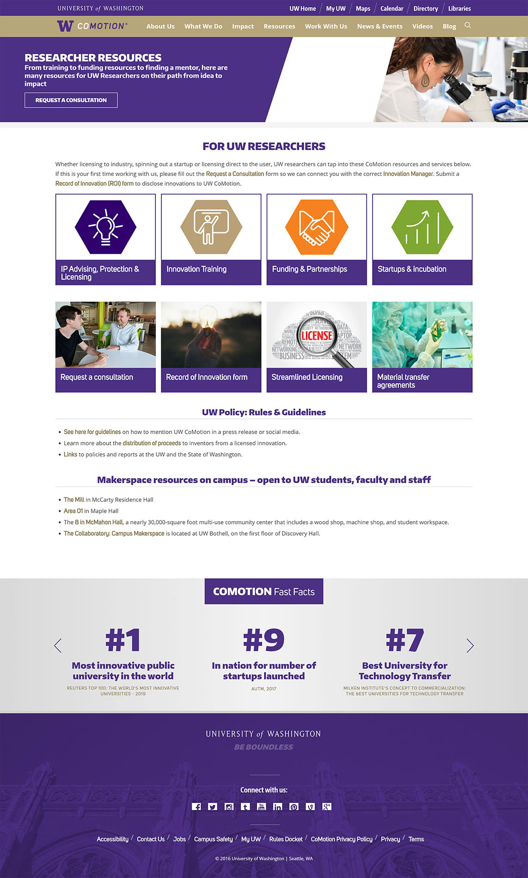
CoMotion partners with UW faculty, researchers, students, and entrepreneurs on their path to market, and helps them amplify the impact of their ideas. They focus in four key areas:

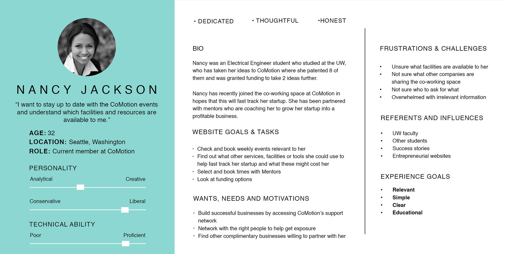
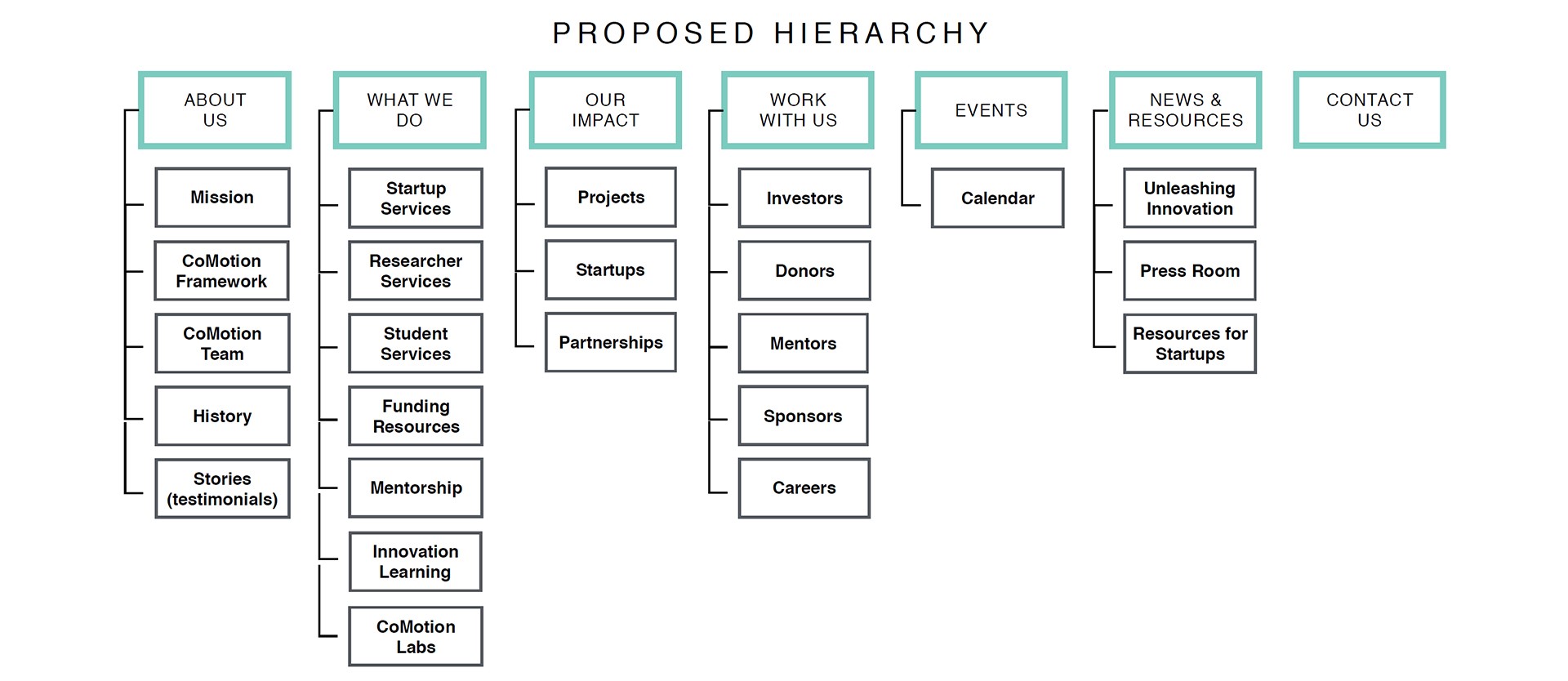
One year before I joined the project, CoMotion hired a UX consulting agency to gain insight into the needs and pain points of UW Researchers seeking to commercialize an innovation at the University of Washington. The agency delivered insights, personas, and a proposed information architecture that directly impacted the structure of the old website:
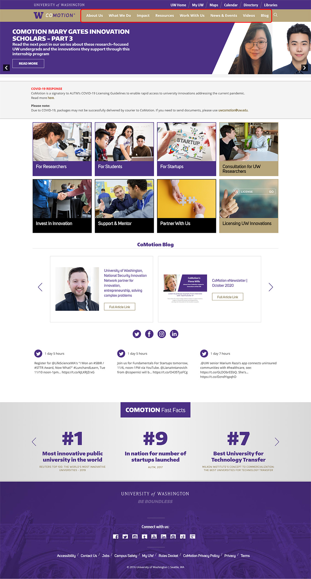
Using the key website goals and tasks identified in the personas, I evaluated the usability of the existing CoMotion website to see if it successfully addressed the key insights found by the consulting agency.
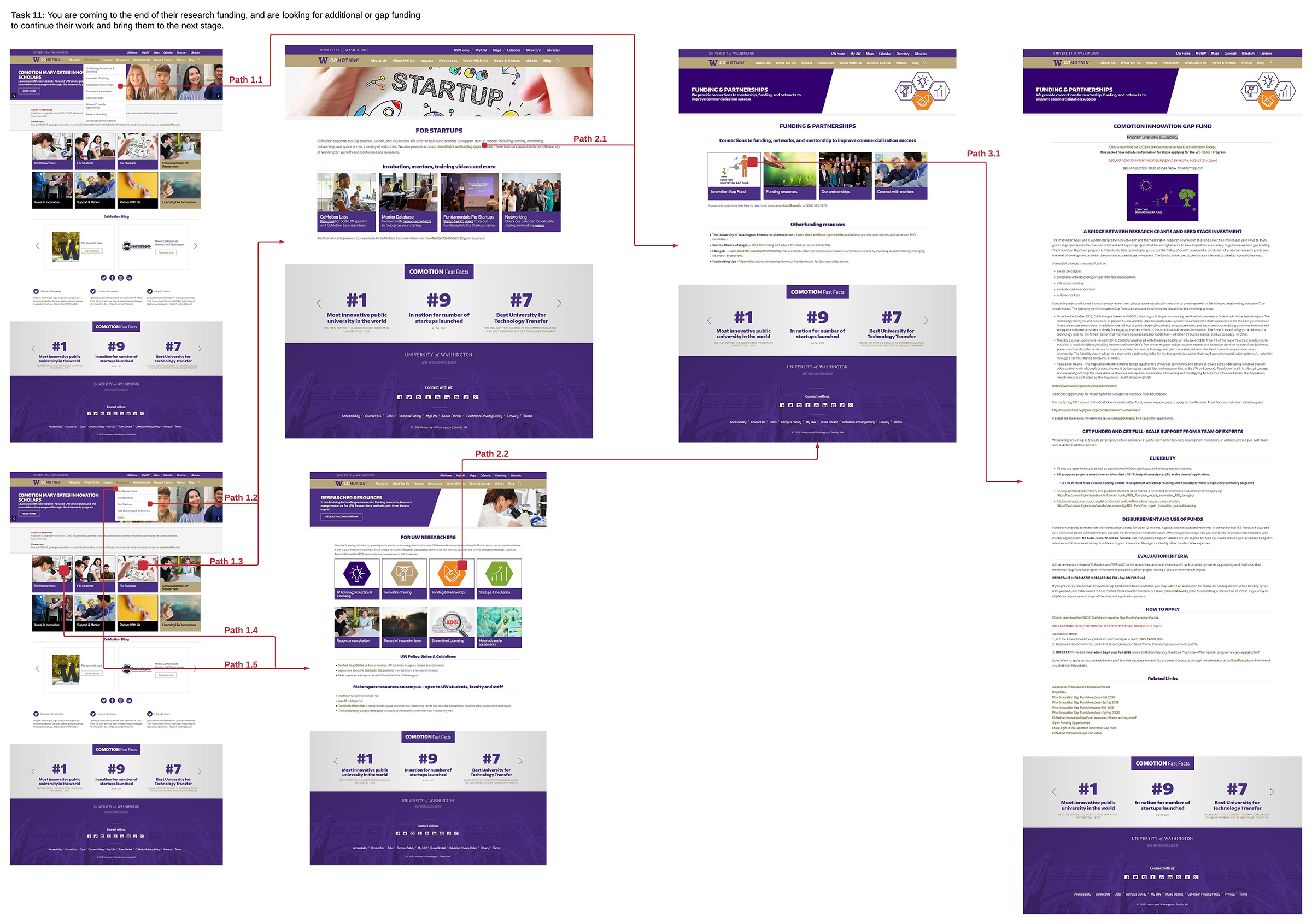
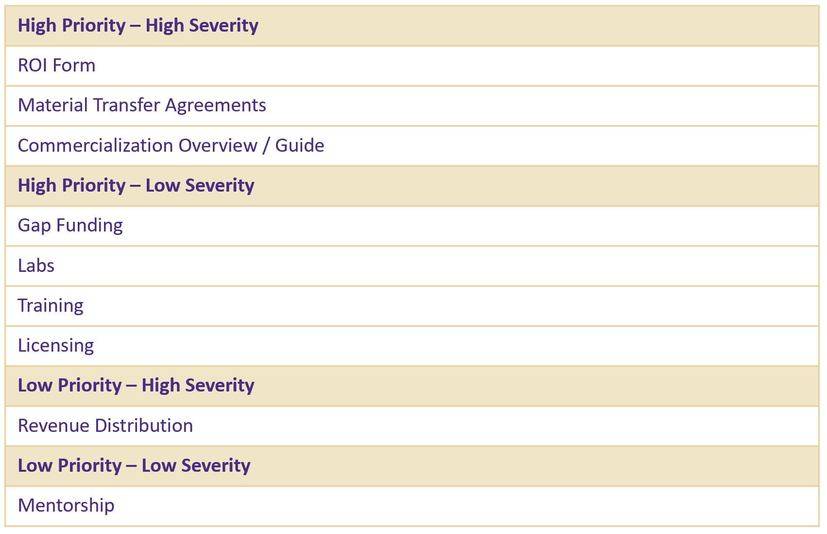
Given that many users coming to the CoMotion website are new to the commercialization process, I wanted to understand the learnability of the website. Working with Innovation Managers, the people who work closely with our key users, I identified 15 key tasks that users perform on the website. For each task I documented all the paths users could take to complete them. At each step, I assessed 4 evaluation questions to determine which tasks had the most severe usability problems.
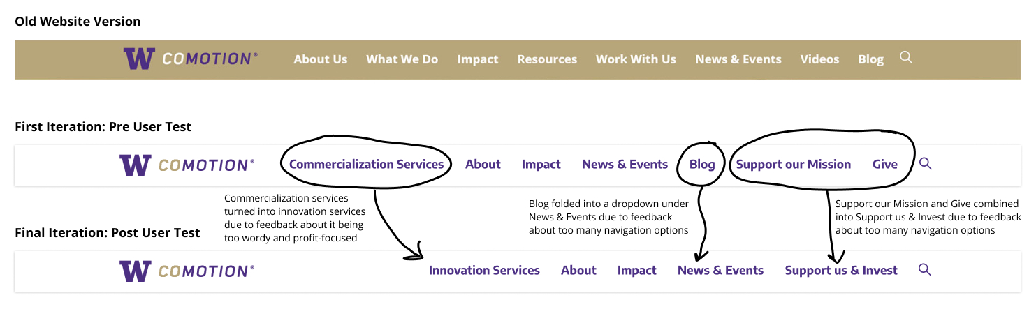
For new users who may not be acquainted with business and legal terminology, navigating the website can be confusing. There is little context given to links and the links are not descriptive enough to understand the type of content they lead to.
Using Nielsen’s Usability Heuristics for User Interface Design, I conducted a heuristic evaluation to identify the website's usability problems. I evaluated the same tasks that I tested in the cognitive walkthrough. Each blue, green, and orange annotation represents a heuristic violation.
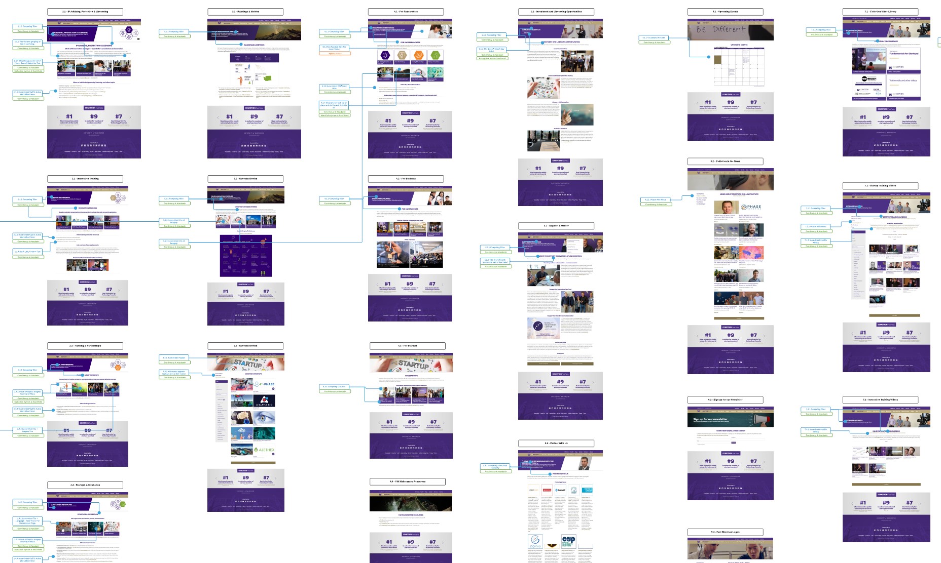
Overall, the old website had major issues with consistency and standards, recognition rather than recall, and aesthetic and minimal design.
For example:
Many of the pages featured two competing H1 headers that were styled in the same way. Furthermore, the title of the page was written in the second H1, which made hard to recognize what page you were looking at.
Establish a clear typographical hierarchy. Lead with the page title, all secondary content should follow further down the page.
The link style was a dark gold typeface that differed from the body text. It is not immediately obvious that this style indicates a clickable link. Furthermore, there is not enough of a color contrast to distinguish links from non-links.
Use a recognizable link style with an effective visual contrast.
There was no consistency in image style across different tiles. Styles varied from stock photography, to graphics, to photos taken by CoMotion. There were instances where one photo represented different destinations on different pages.
Create imageless clickable tiles that eliminate the need for finding abstract stock photography for every type of content.
There was an overall lack of whitespace between text which made it difficult to scan pages. The content on the page felt crammed and was an impediment to achieving a minimal design.
Use ample spacing between headers and body text.
I conducted a survey to understand how UW Researchers and Innovation Managers currently used the website. I also used it to validate my previous findings on a larger scale.
11 UW Researchers
9 Innovation Managers
The survey demonstrated that Innovation Managers play a key role in how Researchers access resources on the website.
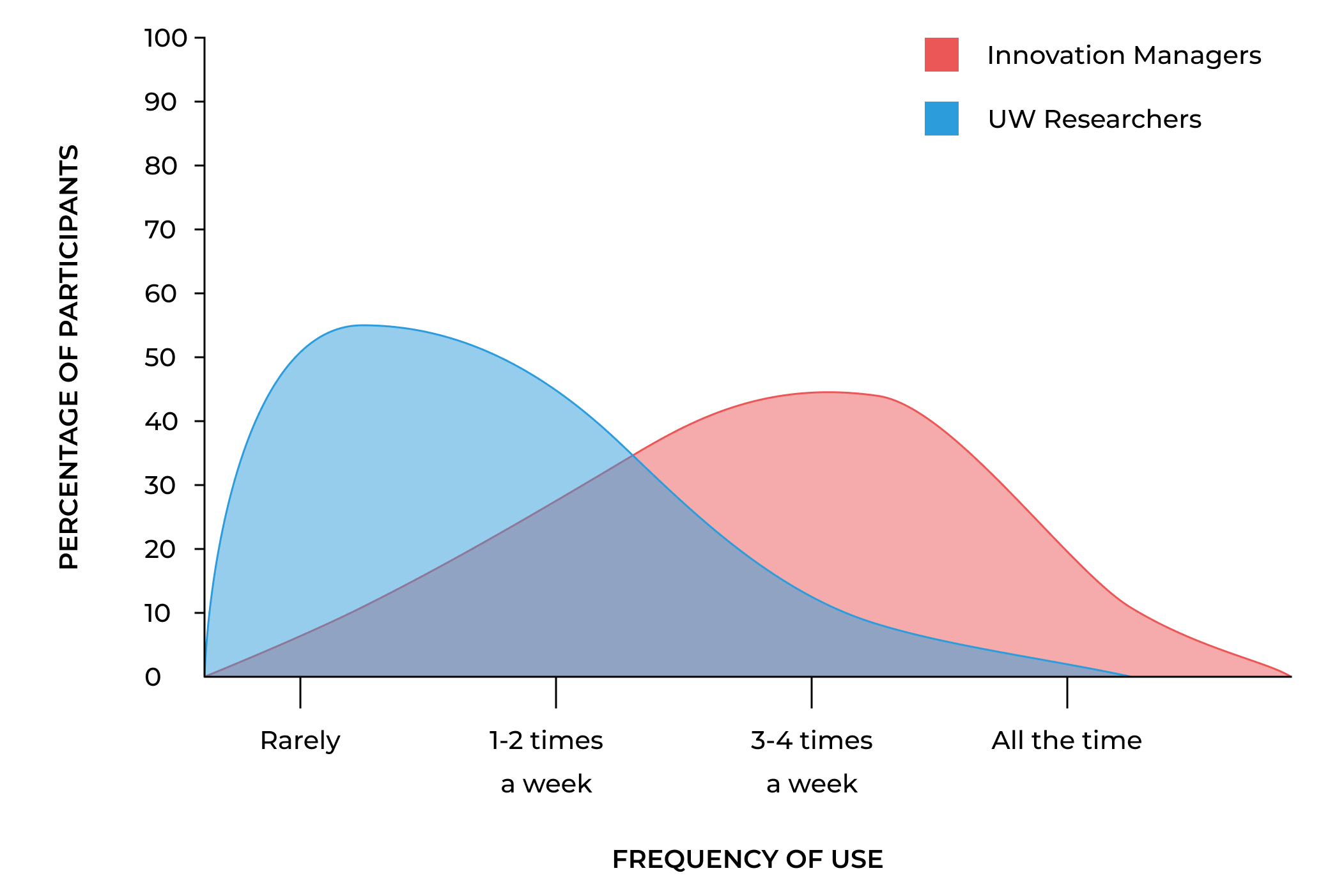
Though UW Researchers are the primary target audience, innovation managers actually use the website more frequently.
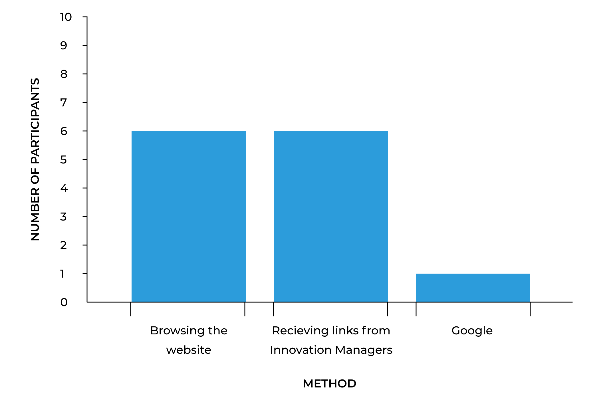
Receiving links from Innovation Managers is a popular of a method of finding resources for UW Researchers.
Record of innovation form, material transfer agreements, funding programs, CoMotion Labs, training programs.
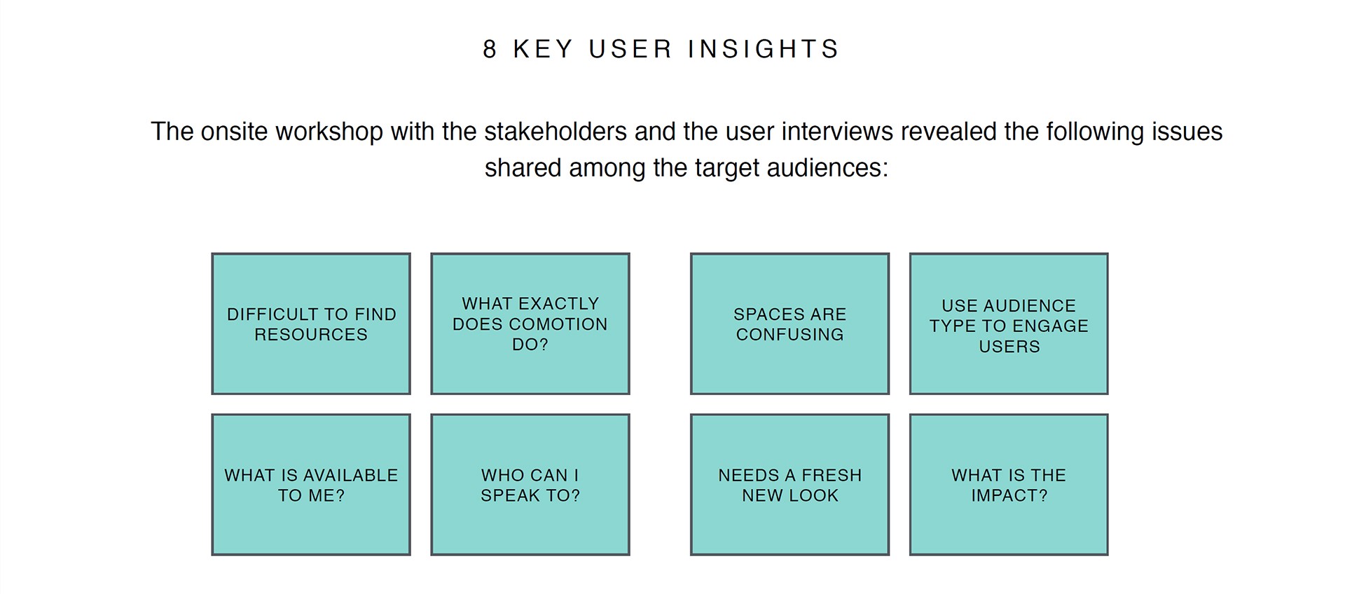
Users can generally find what they need but report frustration with too many navigation options and confusing non-descript terminology.
No. Users are not engaging with links that are labeled "For Researchers, For Student, and For Startups."
No. Users report the visual design of the website being "outdated, cluttered, unorganized."
Given the large scope of the project, I worked closely with the developer to create a phased approach to updating the website. This way we could update the website in manageable sprints and our stakeholders could see that we were making progress.
Using the data from my research, I put together a user journey map to help visualize key points where users interact with the CoMotion website. This map showed how users consistently return to the website over time. Our team saw that the website needed to be functional for both new users seeking to learn about new concepts and experienced users seeking fast access into key resources.
.jpg)
Based on the severity and priority scores from my usability evaluation, I put together a table of tasks to focus on and test during Phase 2 and Phase 3 of the project.
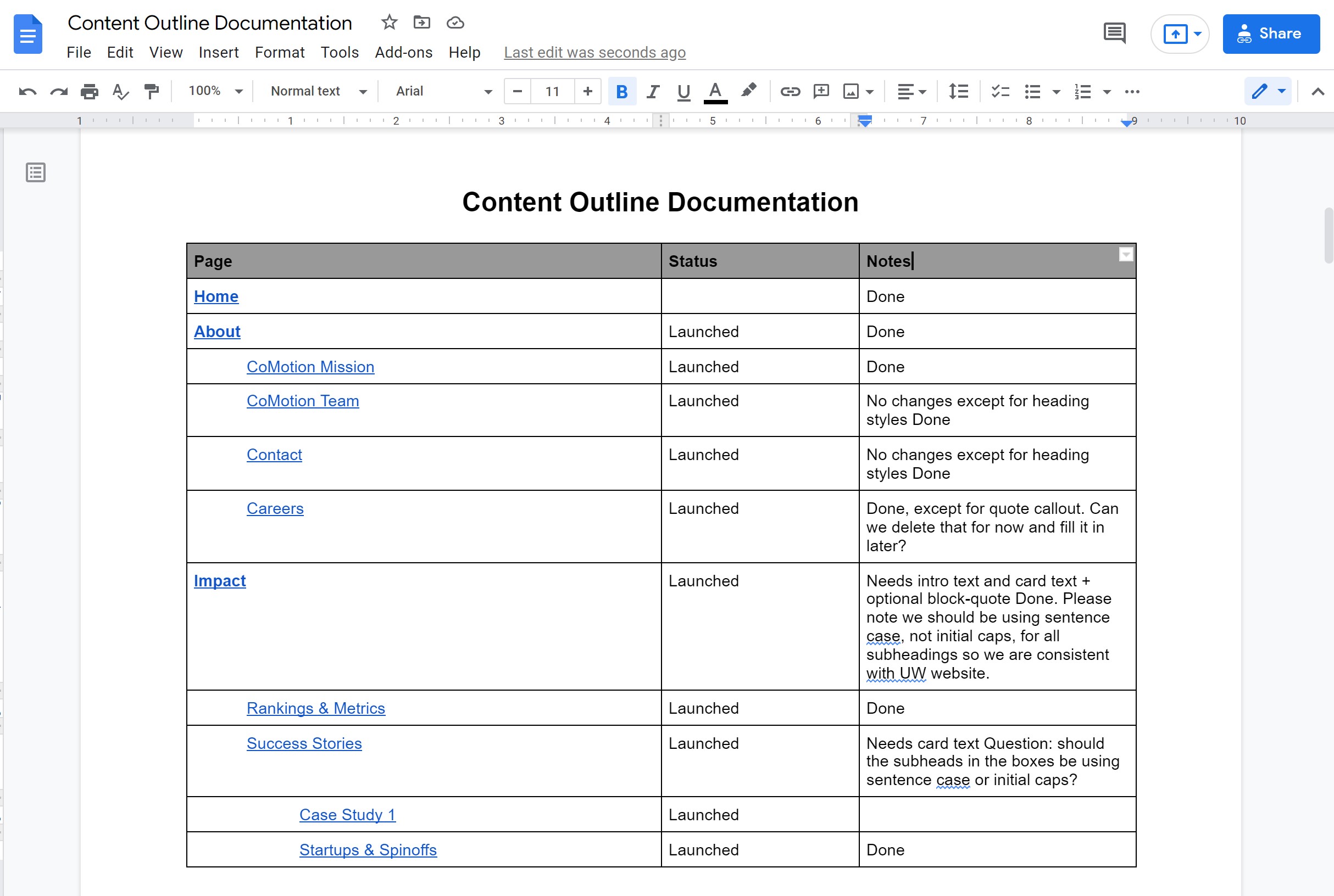
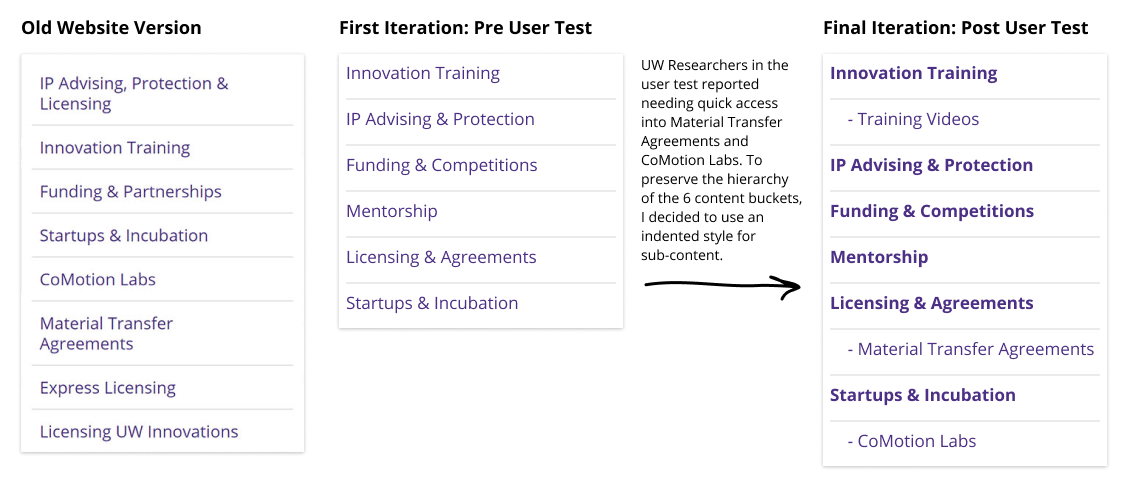
One of the main problems with the old CoMotion website was the lack of organization on the back end. The website consisted of 160+ pages of content that were placed without a system in mind. This lead to convoluted URL paths and redundant content that was difficult to maintain.
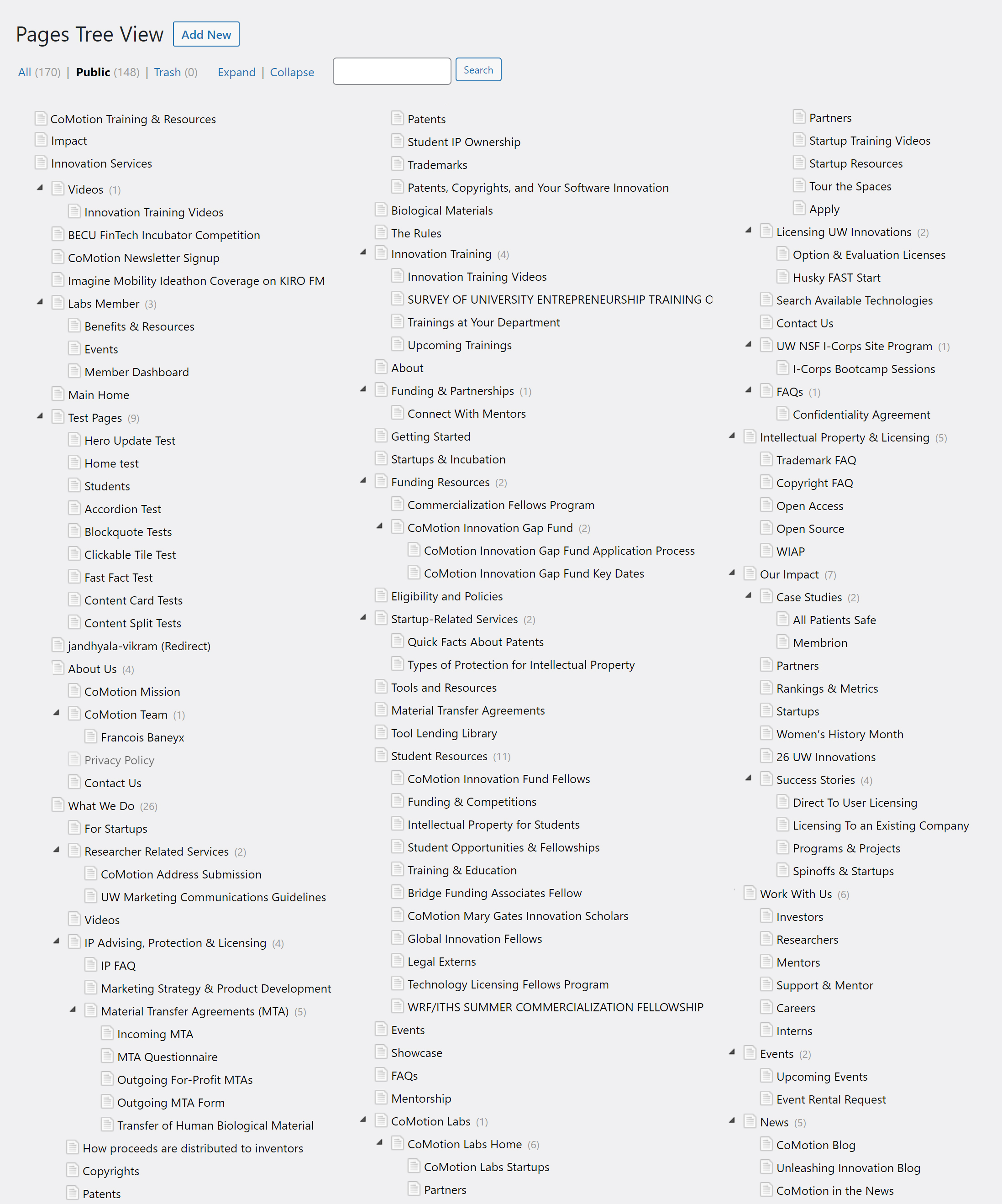
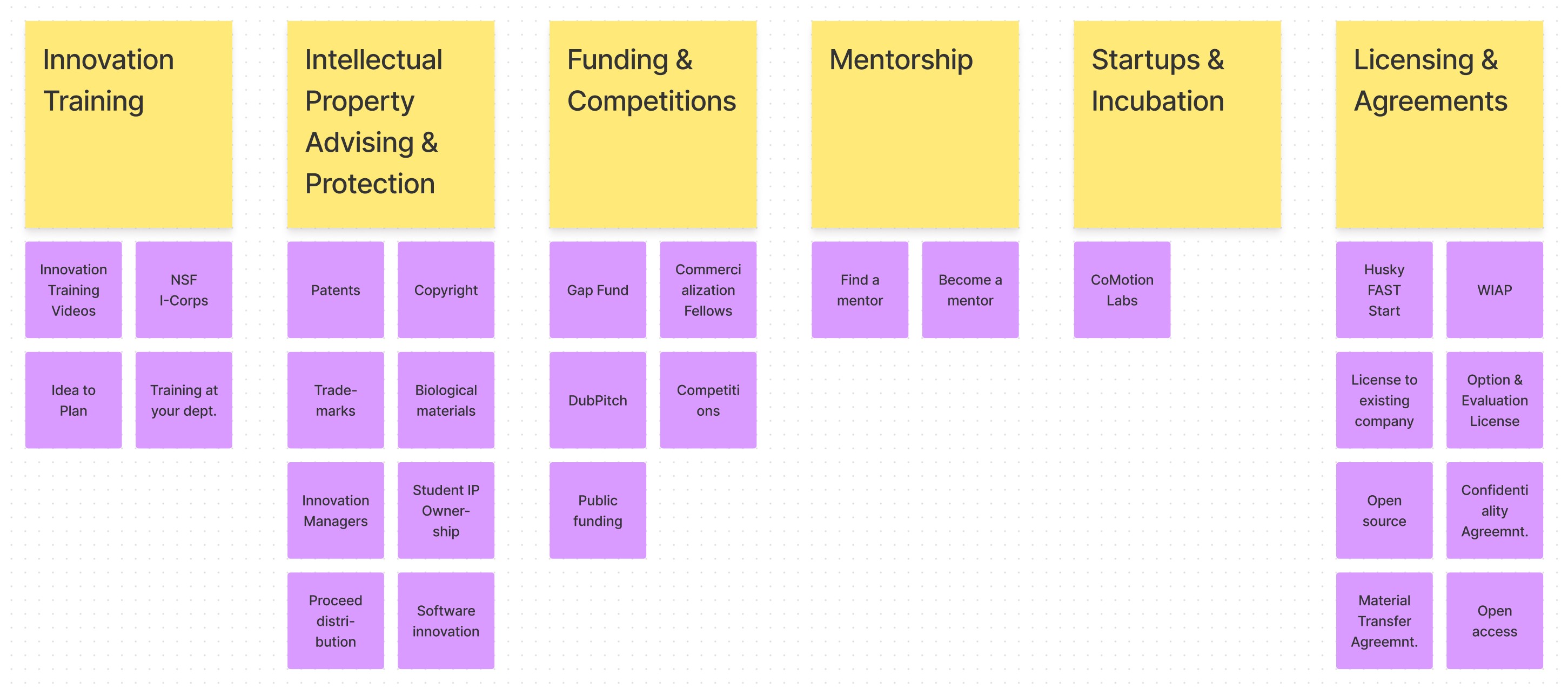
I replicated the tree in a Google Doc and had various stakeholders from CoMotion's leadership sort each page into content buckets. The document went through several iterations but eventually we managed to group the bulk of the content into 6 categories.
With so many moving pages, it was important to keep track of redirects so that users with bookmarks into key pages could still access the content they needed without interruption. I created a document that helped track the URLs of each page.
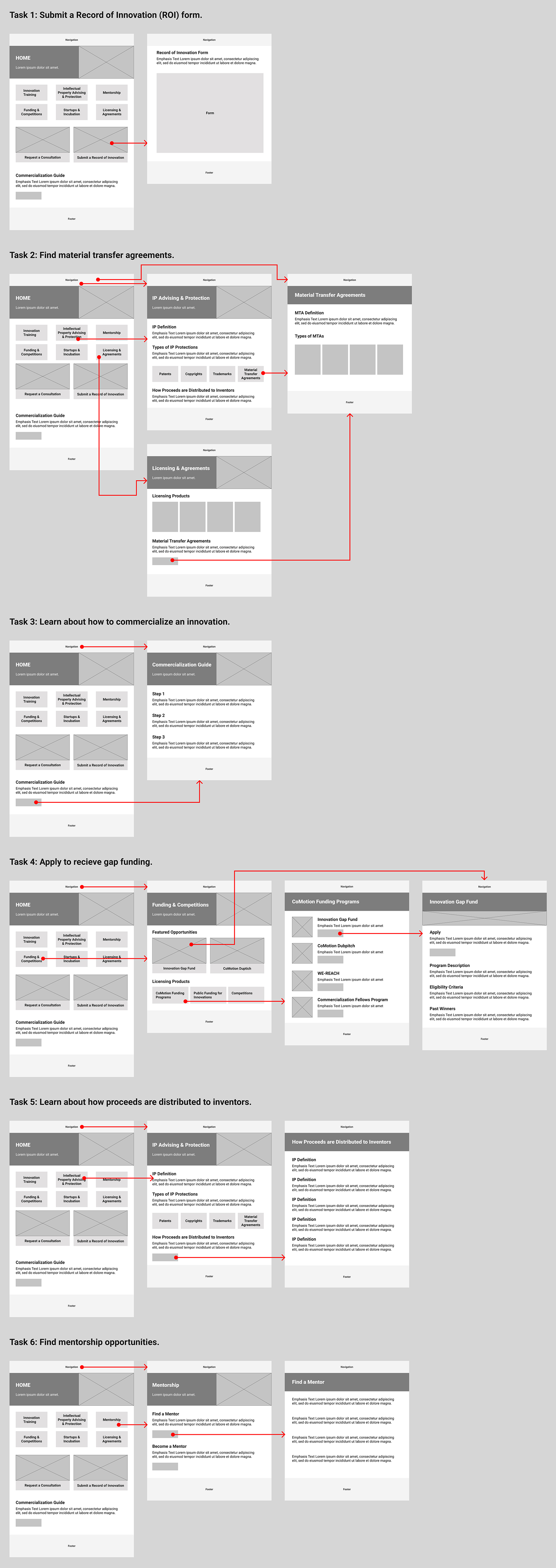
I created wireflows for key tasks to plan the structure and layout of the pages. The wireflows helped me establish a hierarchical pattern for page heros and build an early iteration of the home page.
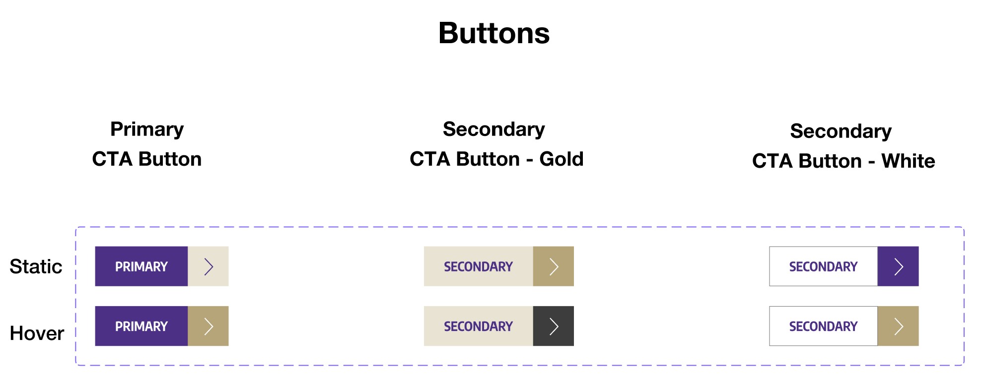
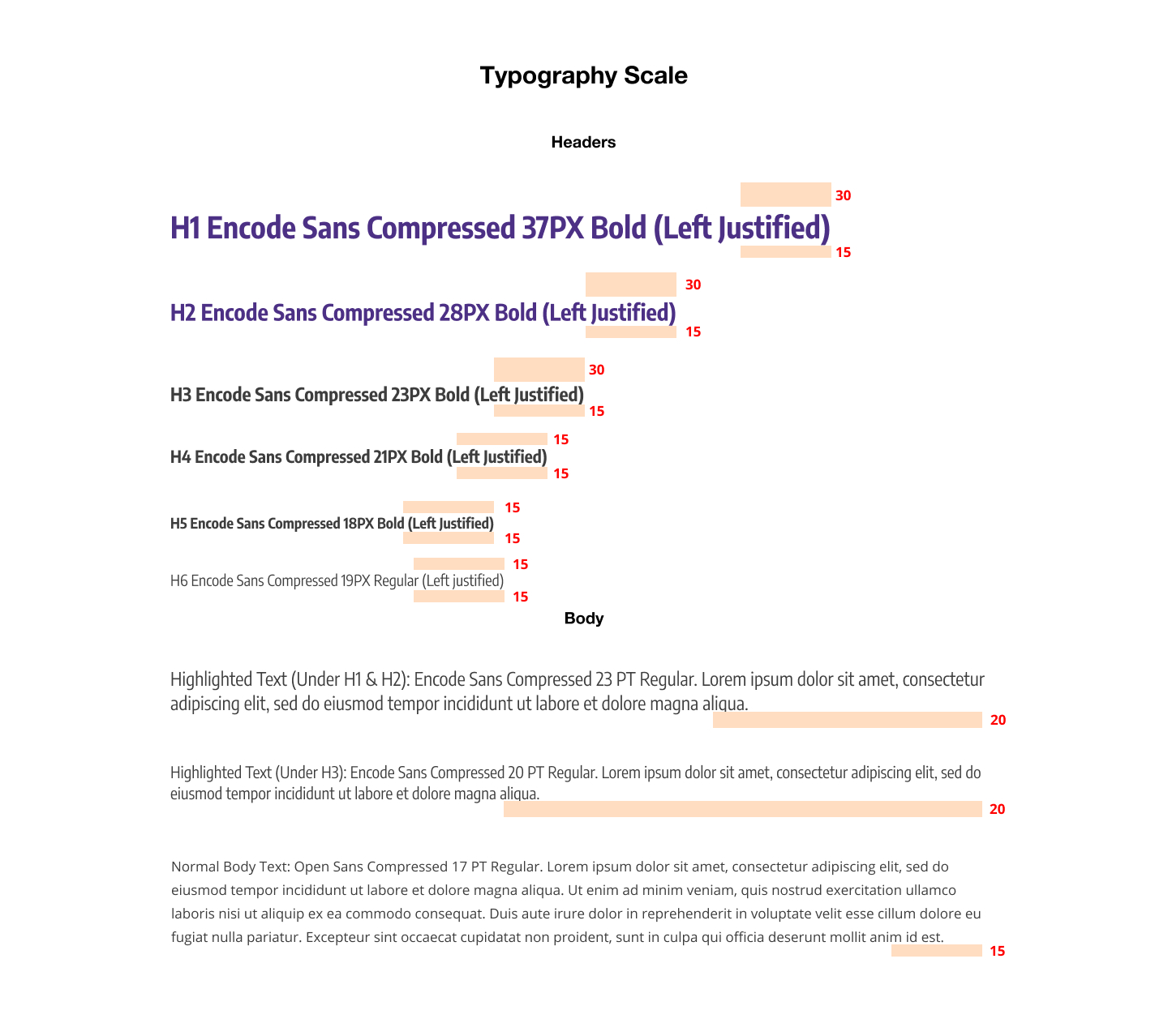
Once we had a plan for a new page organization, I began creating a design system of modular components in Figma. These components would help build pages in a fast, structured, and consistent way. I made sure that the components aligned with the UW Brand guidelines.
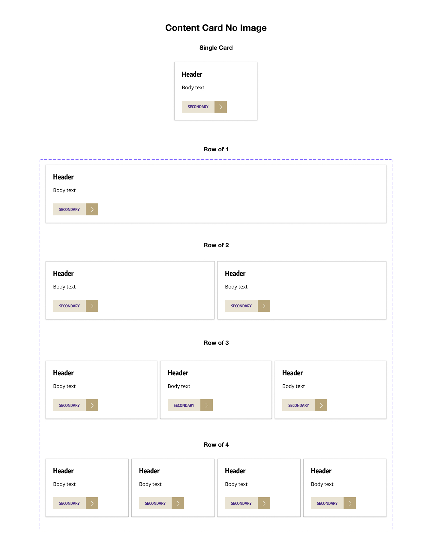
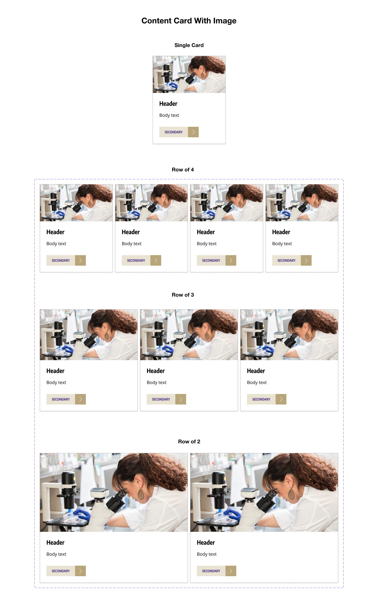
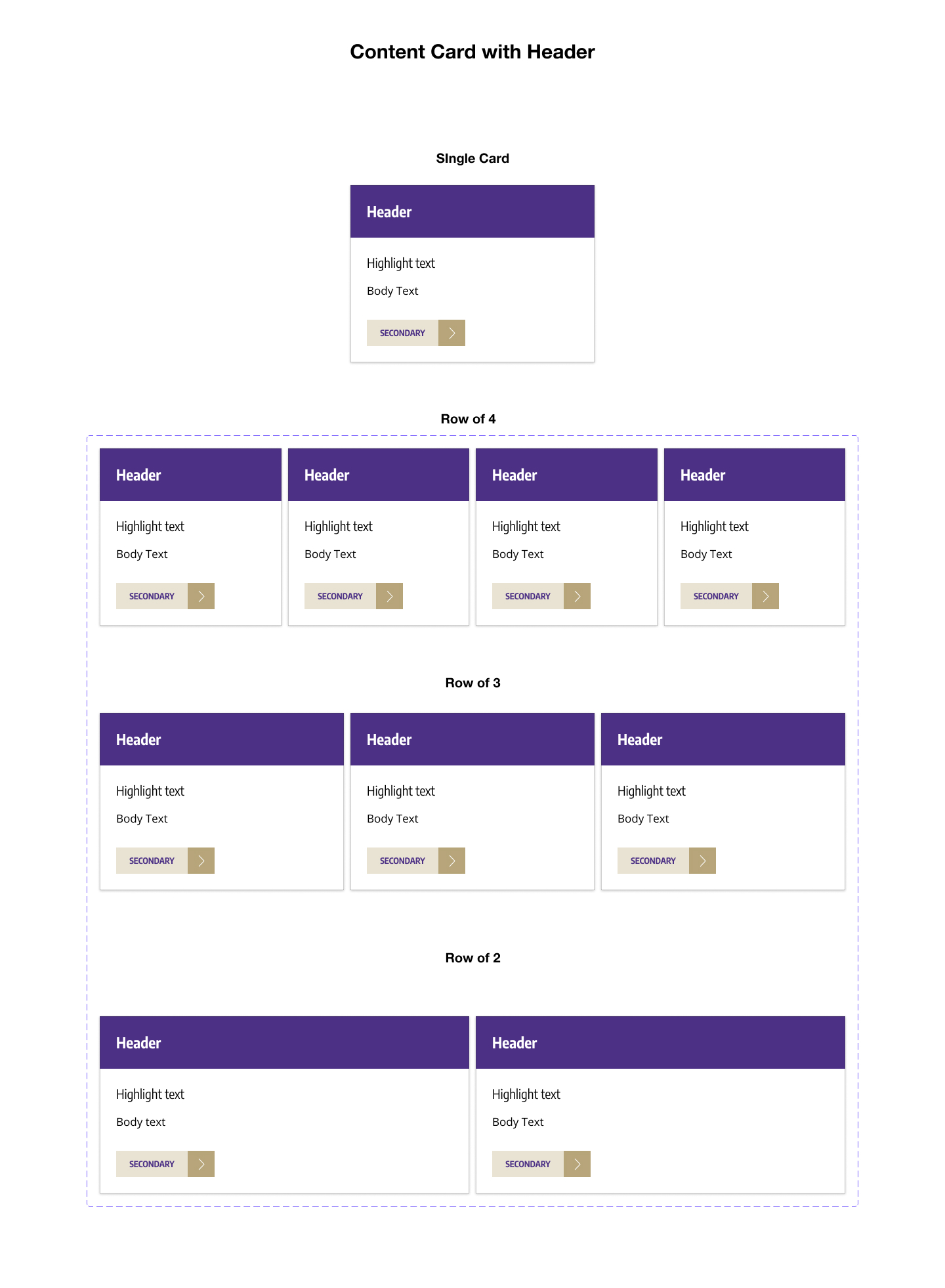
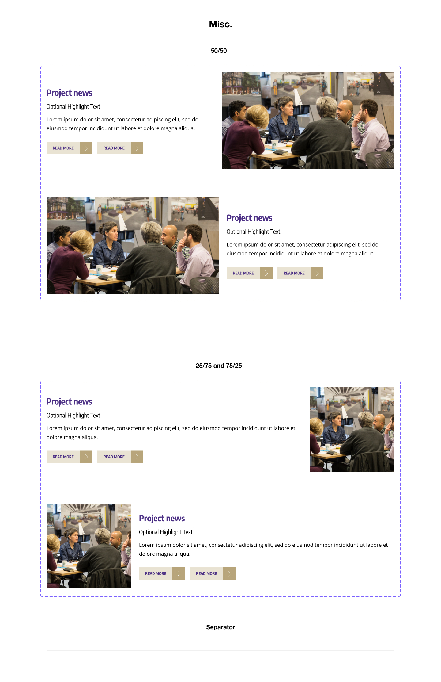
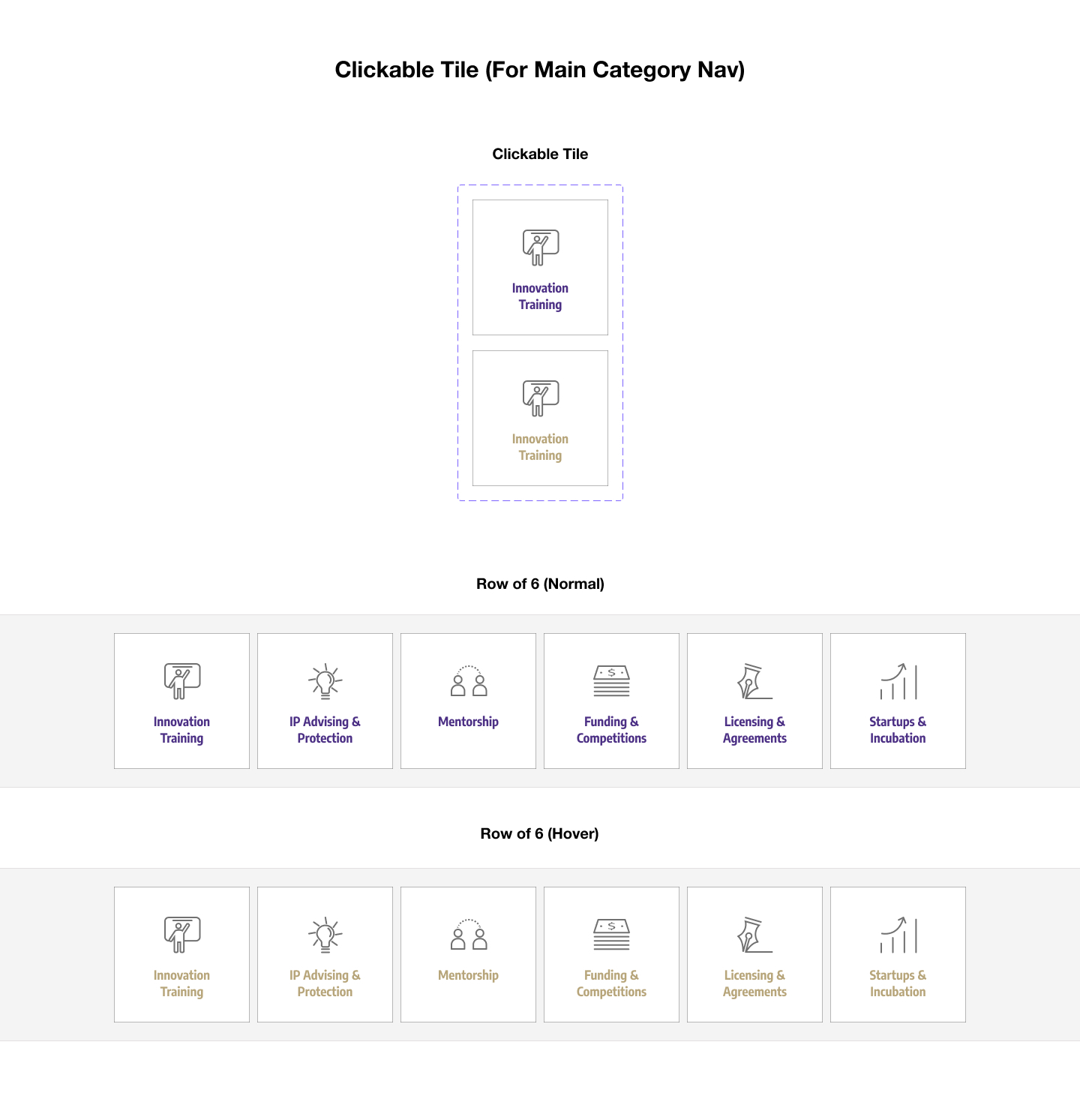
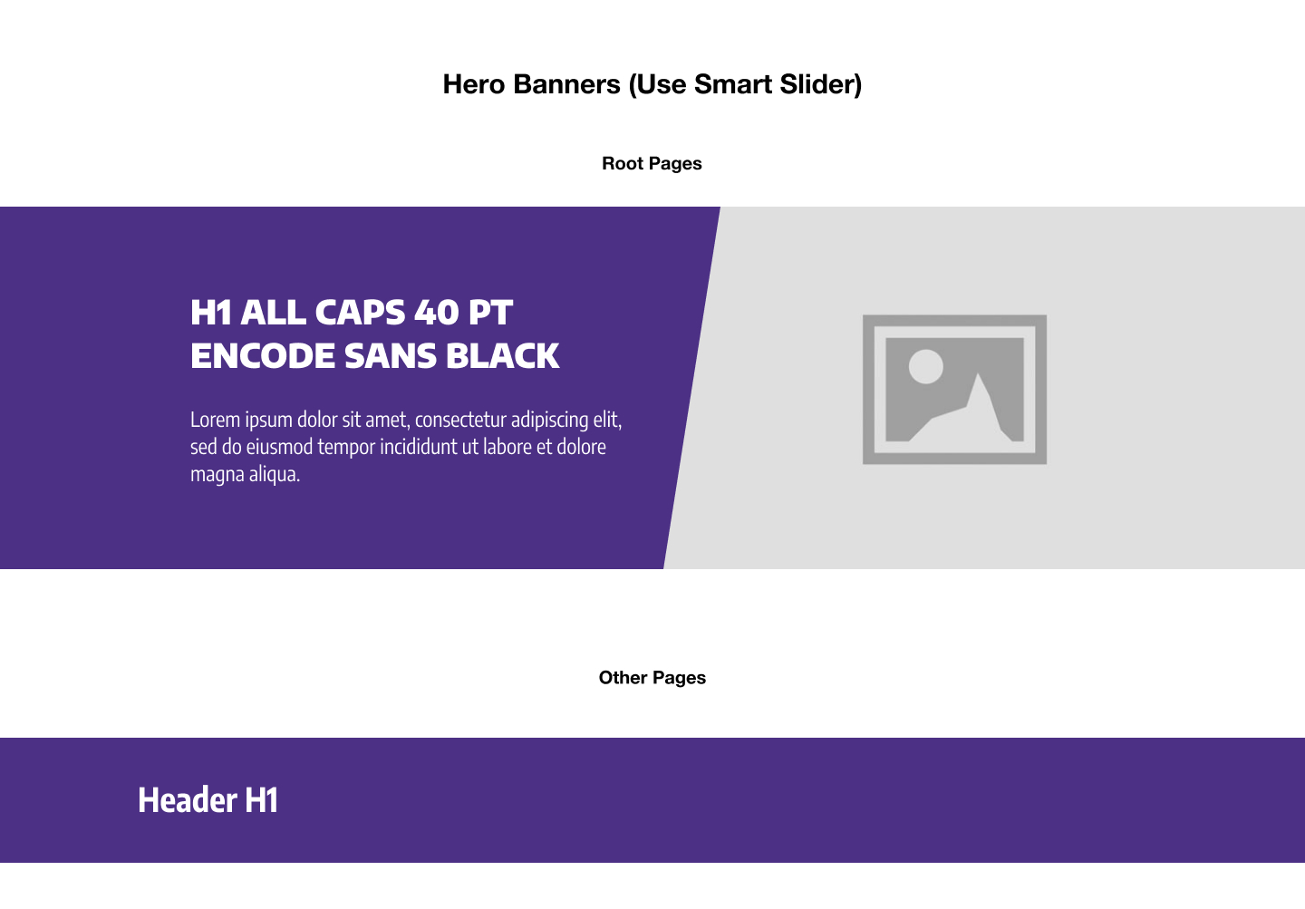

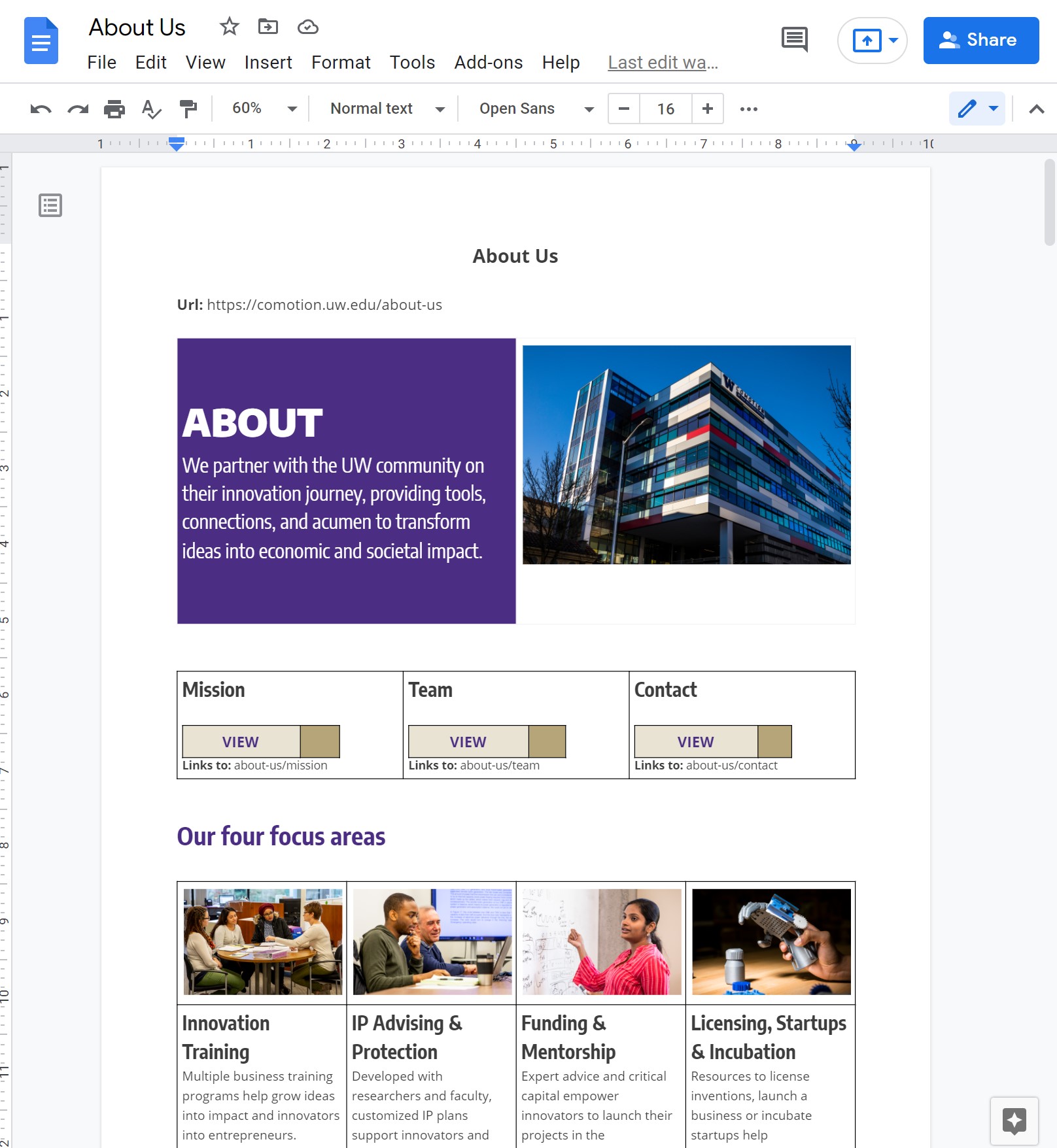
With the new organization and components ready to go, we needed a quick way to outline pages and review content. Given the sheer scale of the website, I knew that diving into building out the pages in Figma or Wordpess would be an inconvenient way for stakeholders to leave comments, review content, and make edits. Thus, my solution was to replicate my components in Google Docs, a tool familiar to all of my coworkers. Using text, tables, and images, we were able to quickly mock-up and review each page before building it out on the actual website.
Even though we had a good understanding of the structure and content of the new website, we were still unsure about the navigation and layout of the home page. To refine our proposed design, I built an interactive prototype of the new website for user testing. Each blue arrow in the prototype represents a pathway from a link to a page.
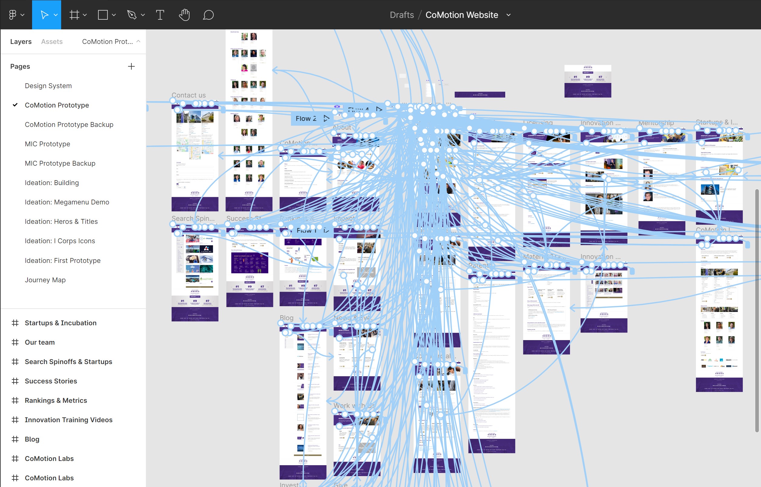
To test the prototype, I put together a set of 10 key tasks and asked participants to walk through the tasks over zoom.
4 UW Researchers
4 Innovation Managers
4 Project Team Members
5 People Outside of CoMotion
As I ran the tests, I tweaked the prototype based on the feedback that participants gave. I kept updating the prototype incrementally until all types of participants could complete each task with ease.
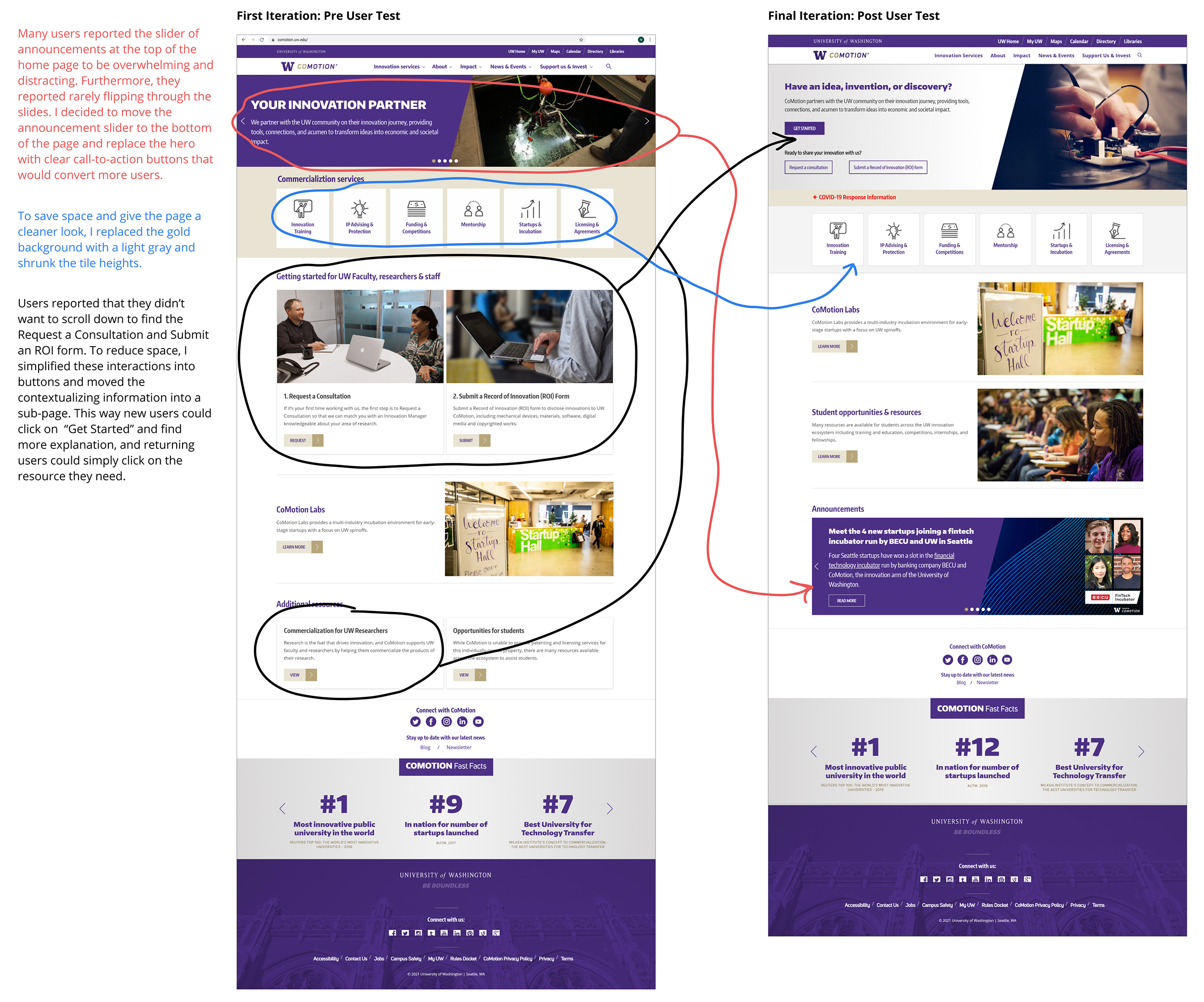
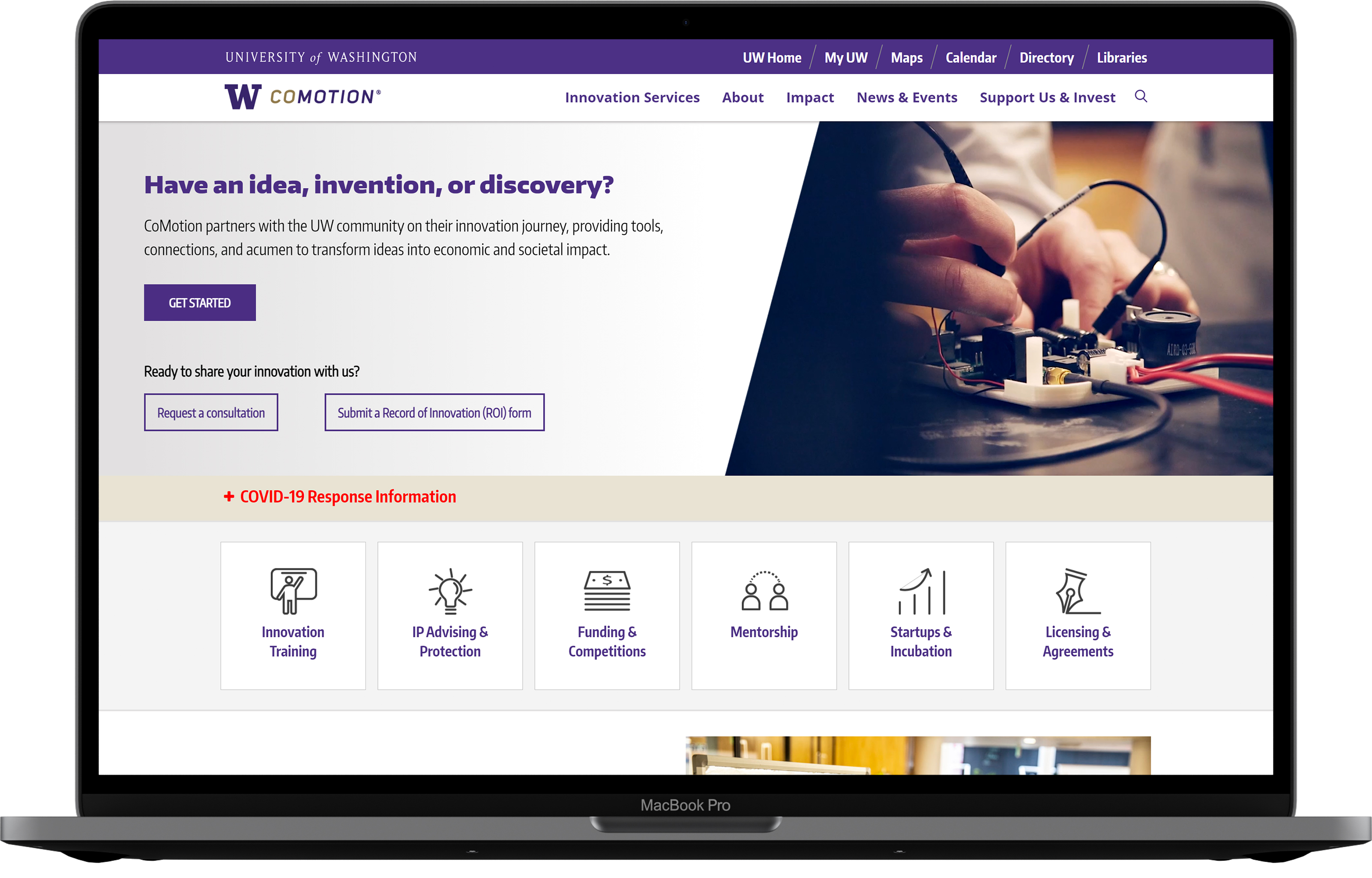
Overall, the new home page was cleaner and more focused on the main audience:
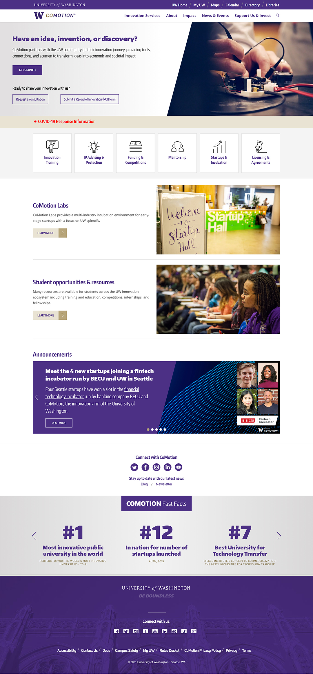
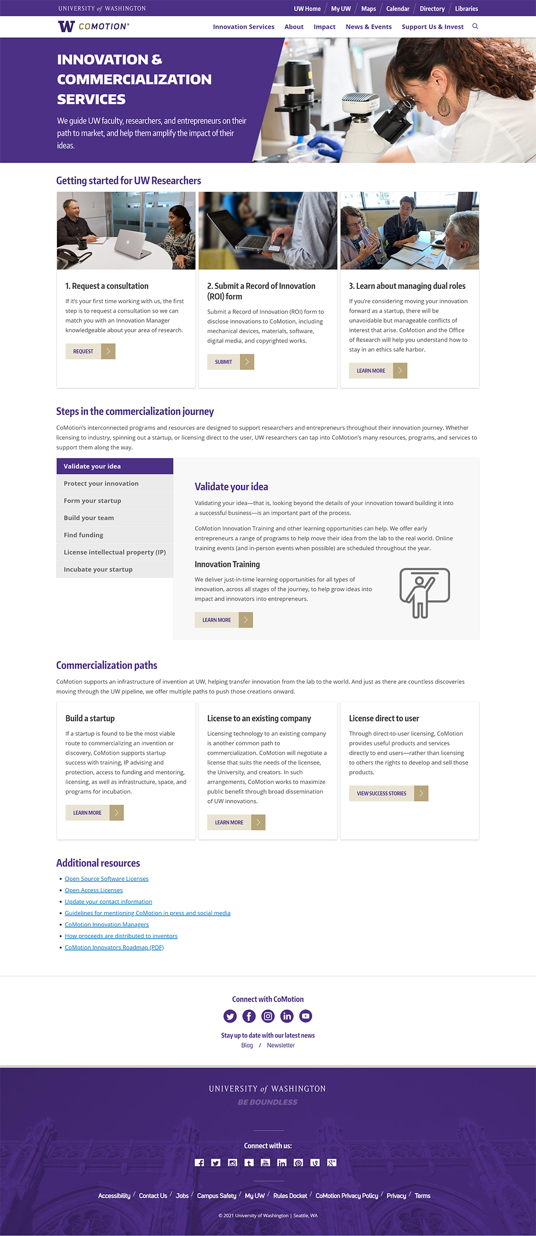
The new commercialization page, formerly known as "Researcher Resources" gave more context to the various services that CoMotion offers.
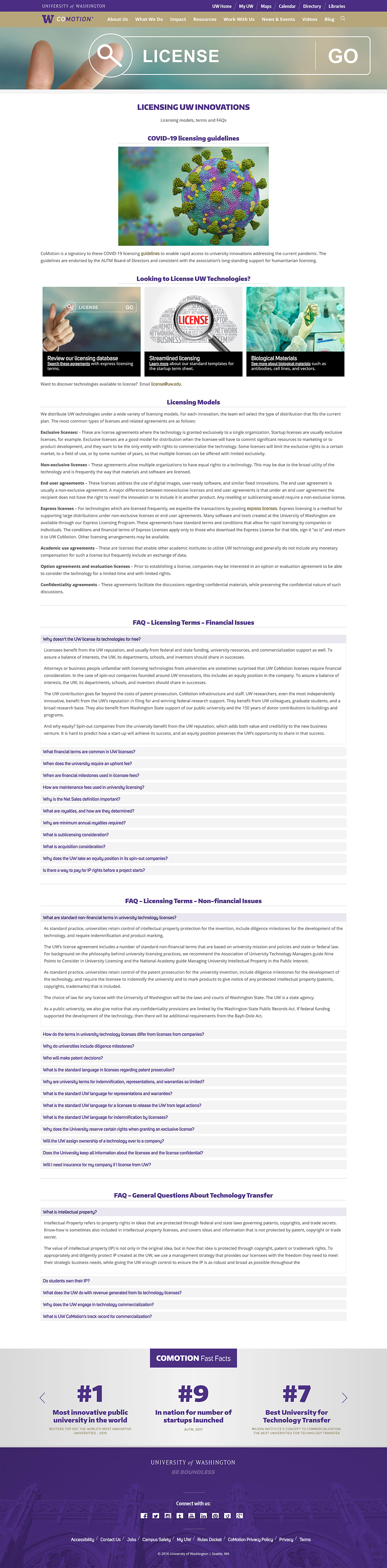
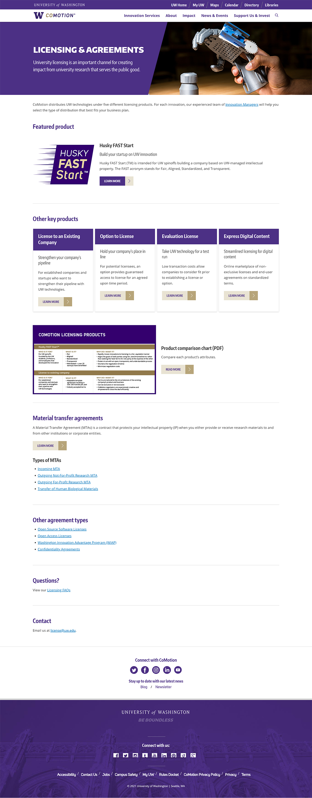
The new licensing page drew more focus to the Licensing products that CoMotion offers, and reduced the information into bite-size pieces. The long list of FAQ questions on the old site was moved into a subpage to reduce the page length.
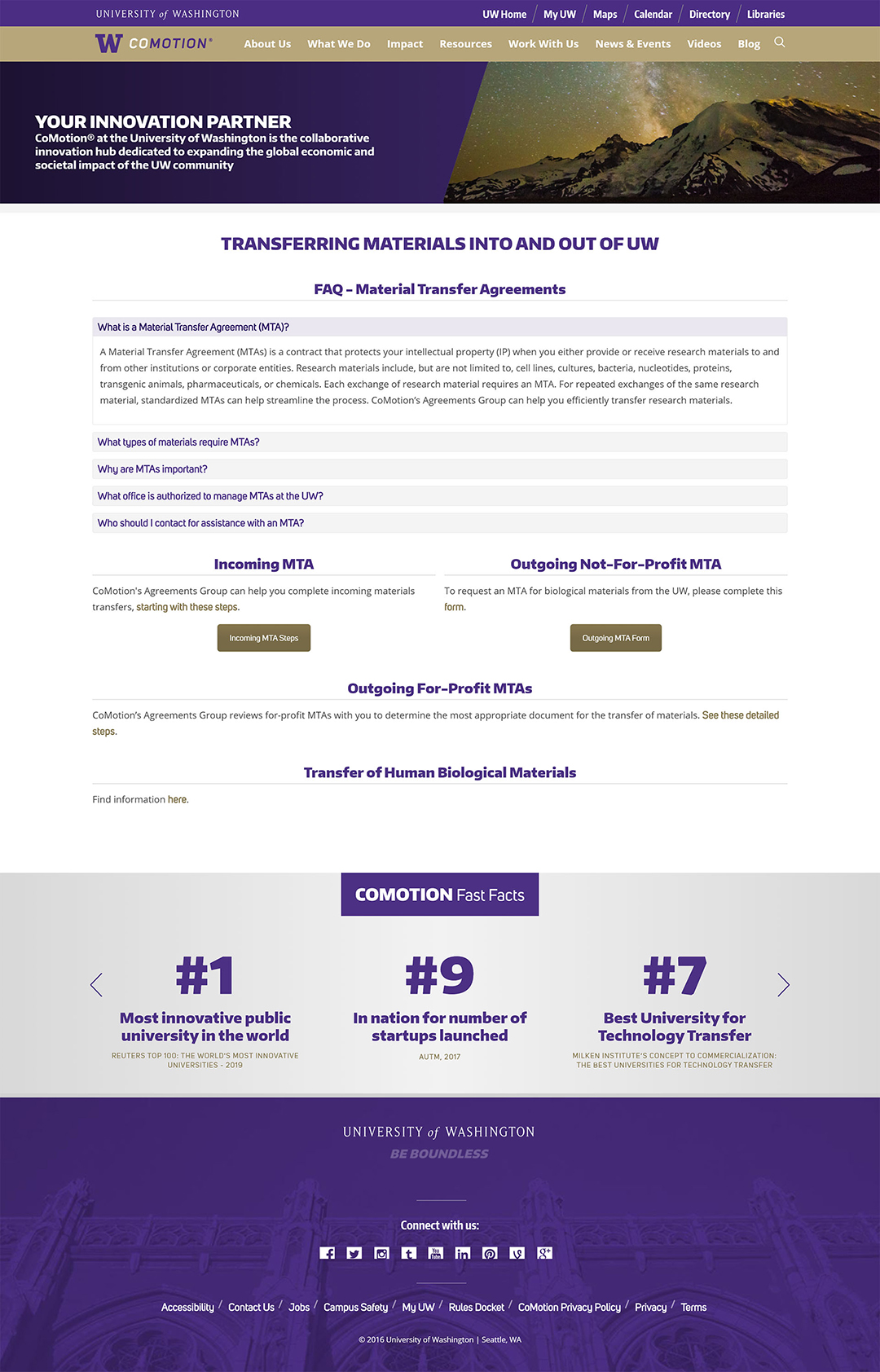
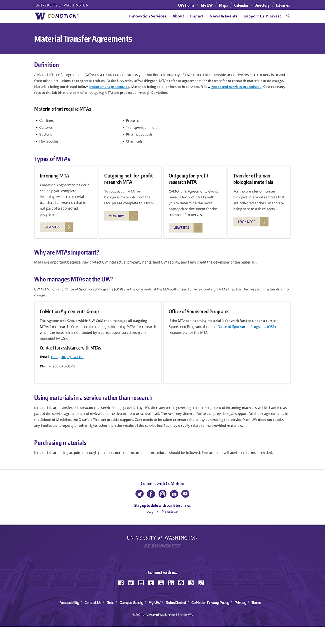
The new MTA page reformatted content in FAQ accordions into easy-to-scan headings and subheadings. Using the content-card components, it laid out MTA types in a much clearer way.
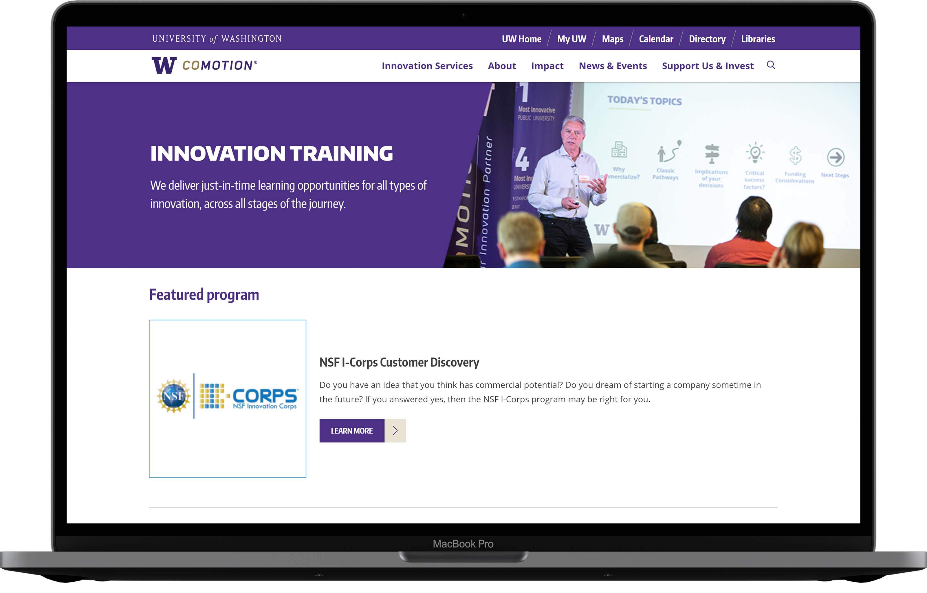
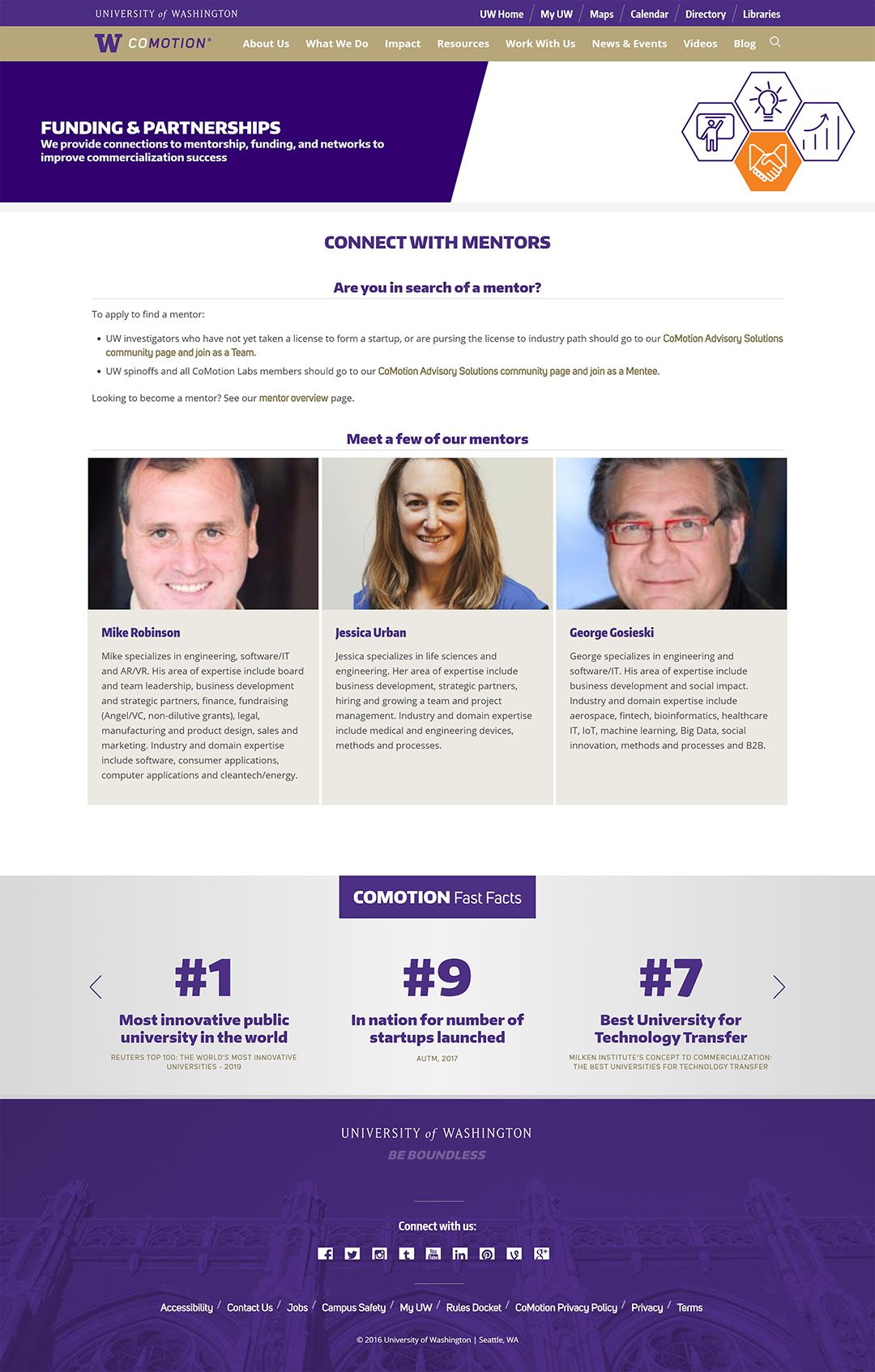
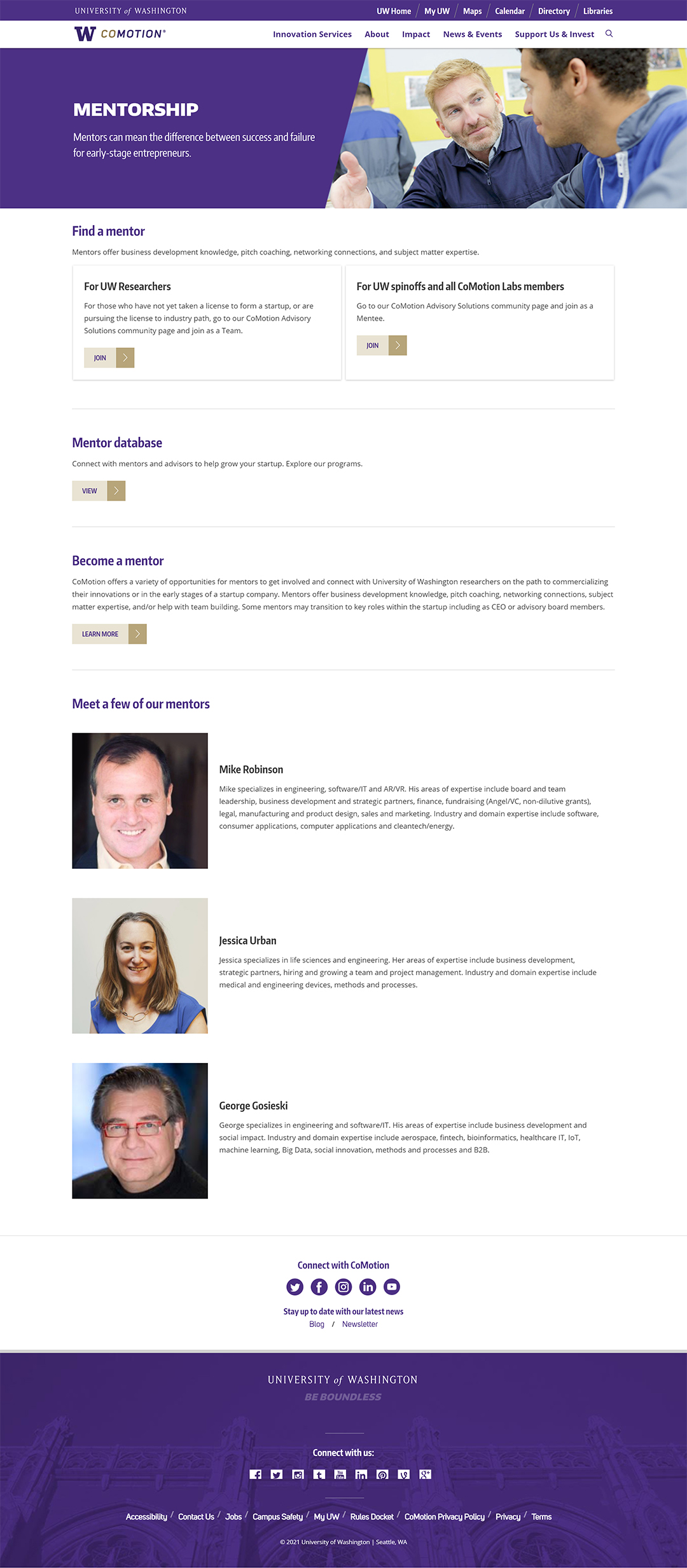
The mentorship page, once hidden under the old category of "Funding & Partnerships" now lived in a more prominent way on the website. Leveraging the new components, it better oriented users to where they needed to go.
This project was the largest UX project I have every been a part of. As the only UX Specialist on the team, I found myself filling the shoes of a variety of different roles, from researcher, to designer, to project manager. I had to find ways to manage a large-scale UX project using tools that my peers and stakeholders could easily pick-up and understand. I learned how to create project roadmaps and prioritize tasks based on their importance.
This project was also the first time I worked very closely with a developer, which taught me how to translate my designs into concrete technical requirements. I learned how to build a design system with component variations and automatic layouts.
All in all, I am extremely proud of my team and everybody's hard work. It is truly impressive that we were able to complete this project without ever once meeting in person due to COVID-19 restrictions.
Though the bulk of the project is complete, there are elements which we will continue to improve on incrementally to improve users' experience on the site.
